Do good social network

Alms

11 Apr, 2022

As the first designer at Palta-backed Alms, I took the product from zero to first release in five months, led redesign through two pivots, and owned everything from onboarding and core flows to design system, brand and landings.

Timeline

2020–2022

Role

Founding Designer

Scope

UX/UI, Design System, Brand direction

Product

0

1

, B2C, Wellness

Surfaces

iOS, Landing

Alms was a social-impact wellness app funded by Palta (Flo Health, Simple, Lensa, etc). It helped people feel better through small real life actions, like helping others or building healthier habits.

Over two years it moved through three models: personal challenges, social network, and creator-led platform. The audience was 30–40+ already paying for apps like Headspace and Calm, and the final direction used creators as the distribution layer to bring them in at scale.

The challenge

Pandemic isolation made people want to feel better and more connected. The hard part? That kind of behaviour happens offline, where friction is high and progress is invisible. Our goal was to connect people online in a meaningful way and make their self-improvement progress visible.

The challenge

Pandemic isolation made people want to feel better and more connected. The hard part? That kind of behaviour happens offline, where friction is high and progress is invisible. Our goal was to connect people online in a meaningful way and make their self-improvement progress visible.

The challenge

Pandemic isolation made people want to feel better and more connected. The hard part? That kind of behaviour happens offline, where friction is high and progress is invisible. Our goal was to connect people online in a meaningful way and make their self-improvement progress visible.

Approach

Alms wasn't built through a textbook discovery track. It was built like an early-stage product: an informed founder bet, short runway, and tiny core team. I worked with the founder, PM, iOS engineers, content, contractors, and Palta stakeholders to ship and learn at the same time.

Approach

Alms wasn't built through a textbook discovery track. It was built like an early-stage product: an informed founder bet, short runway, and tiny core team. I worked with the founder, PM, iOS engineers, content, contractors, and Palta stakeholders to ship and learn at the same time.

Approach

Alms wasn't built through a textbook discovery track. It was built like an early-stage product: an informed founder bet, short runway, and tiny core team. I worked with the founder, PM, iOS engineers, content, contractors, and Palta stakeholders to ship and learn at the same time.

I owned design across the loop, translating user and Palta feedback into shippable decisions while our researcher ran surveys, remote user tests, and diary studies on prototypes I built. Across versions we tracked the same metrics: store conversion, onboarding activation, first action completion, week-one retention, posting rate, and qualitative feedback from tests and creator partners.

Exploration

From market research we saw the pandemic had doubled wellness app downloads, but every player was inward-facing. Our bet was that the same proven product loop could point outward – do good, feel good, share it.

Alms sat between well-being, habit-building, and vertical social networks: emotional motivation from well-being apps, repeatable action from habit apps, and accountability from vertical social networks.
Before writing any code, we pre-validated our hypothesis:

  • Splitmetrics ads tested positioning. The strongest variant hit 38% store conversion, with "impact and sharing" as the winning message.

  • 200+ Typeform responses showed people wanted to do good but felt they weren't doing enough.

  • UserTesting confirmed the concept resonated, but people wanted visible progression and tracking in their life, not just inspirational content.

  • 300 pre-launch email signups gave us enough confidence to build.

That gave us a clear app shape: guided, progress-driven, and action-first.

First version

I defined the brand by one idea: good is the new cool. Same emotional space as Headspace and Calm, pointed outward. Yellow as a happiness signal, realistic photography over illustration, an informal voice that didn't talk down. Nothing that looked like a medical volunteering app.
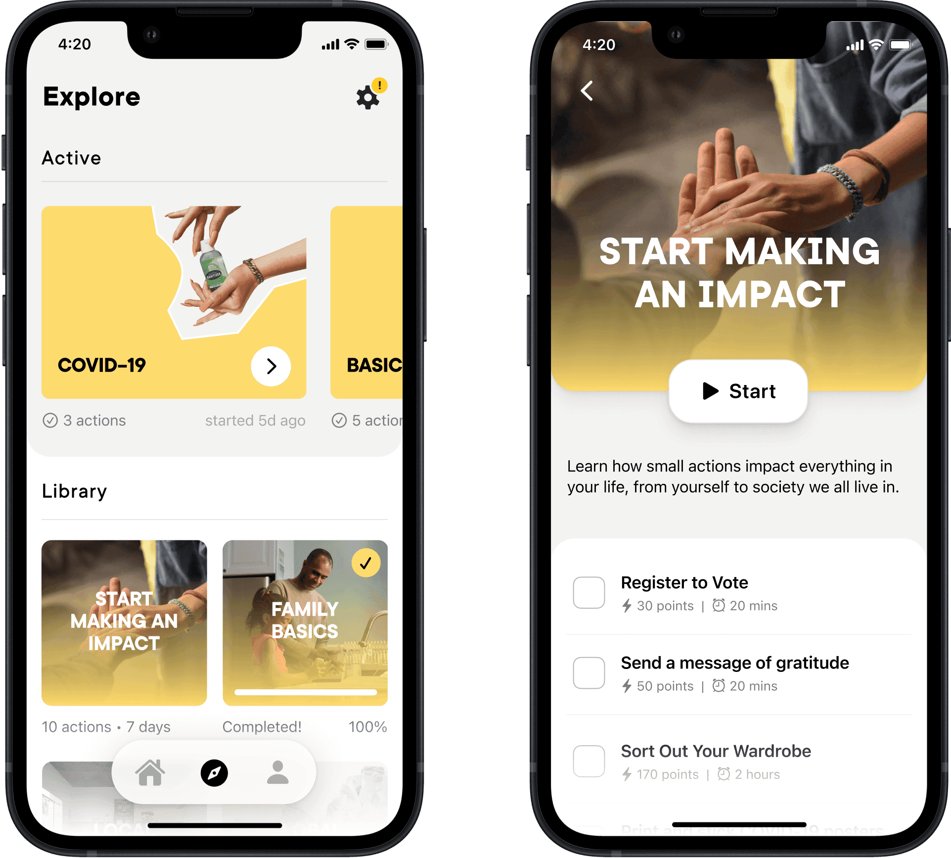
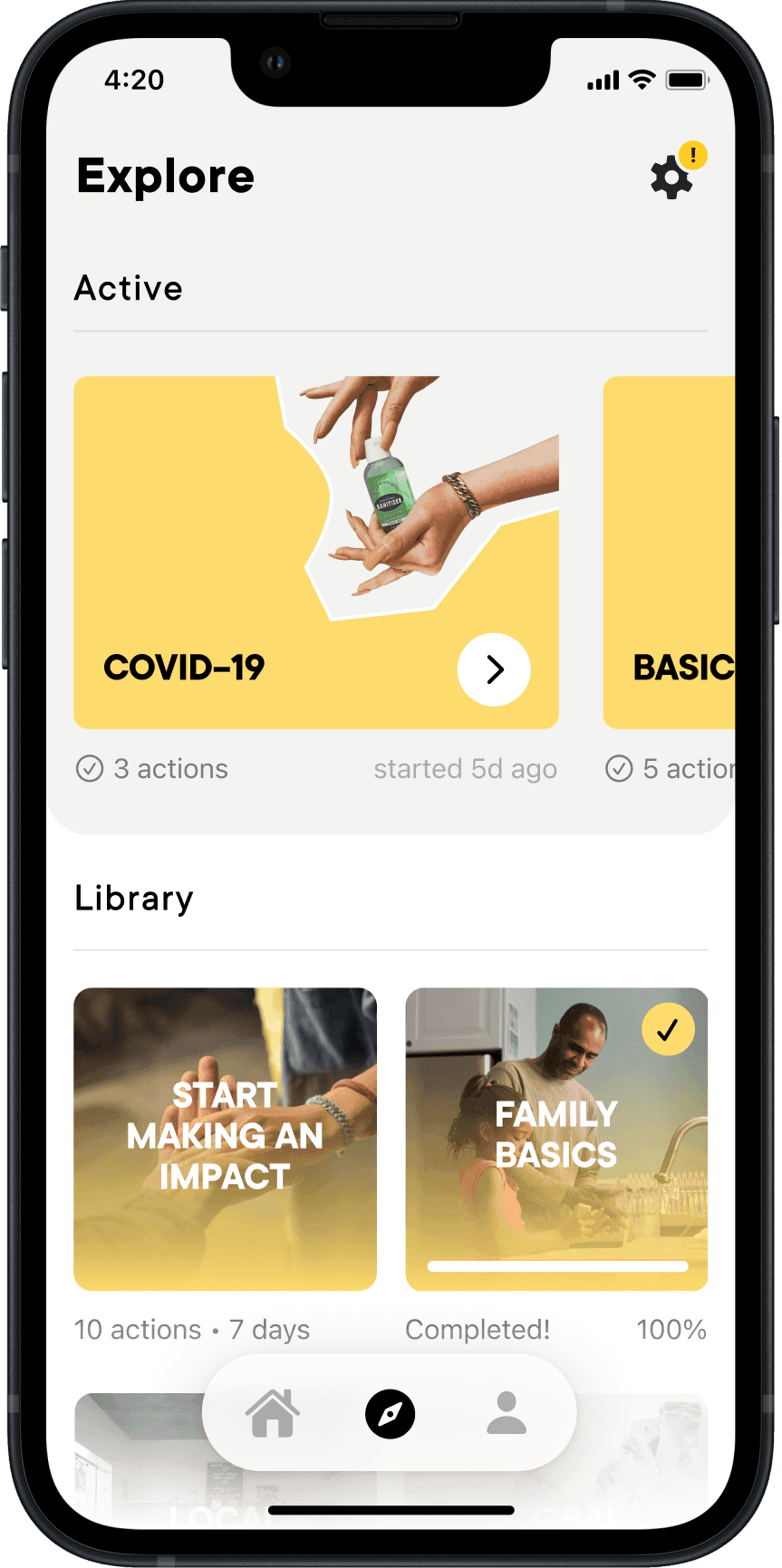
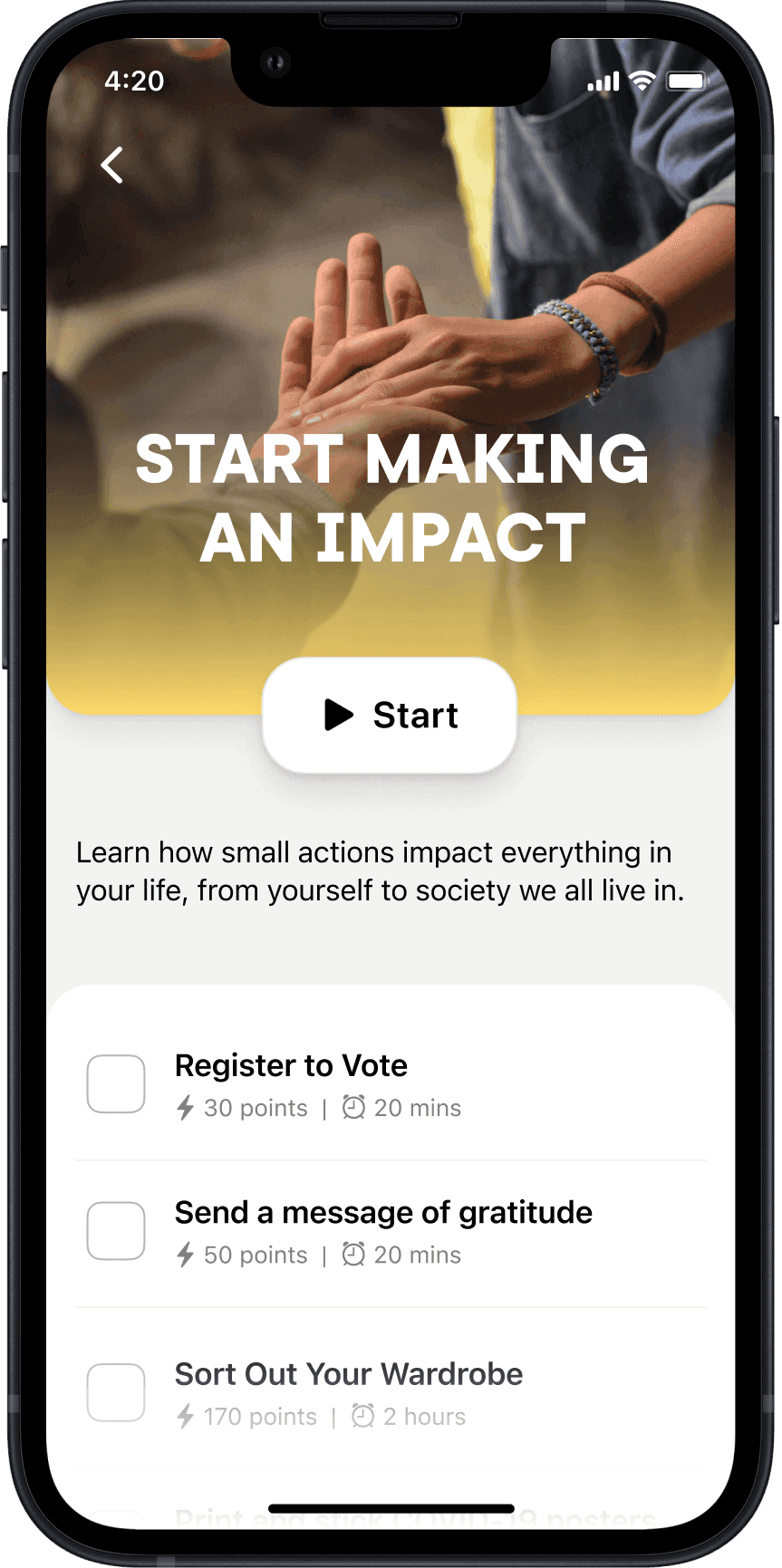
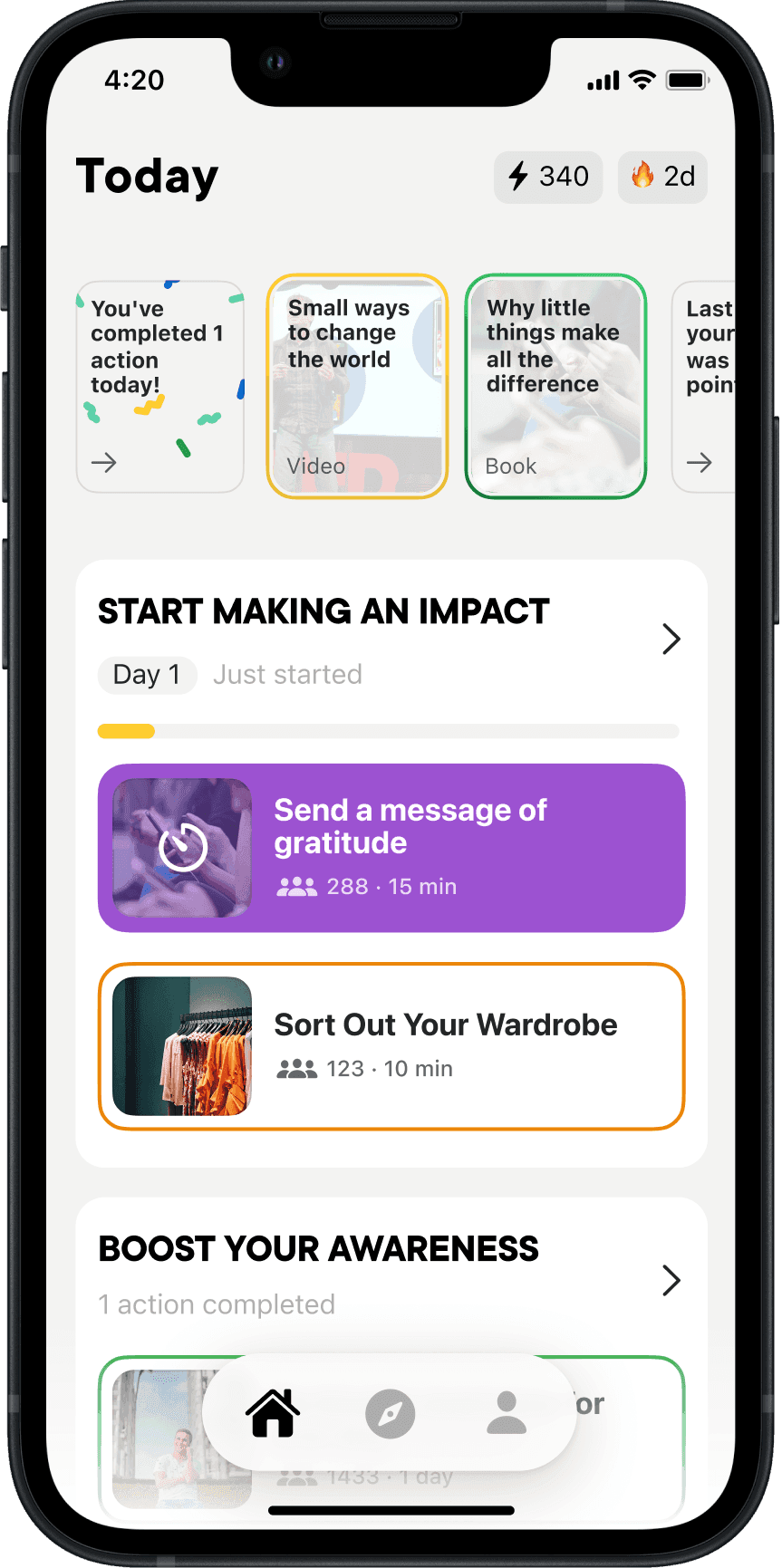
Our first take on challenges and actions

Our first take on challenges and actions

Our first take on challenges and actions

Our first take on challenges and actions

Our first take on challenges

Our first take on challenges and actions

Each challenge contains actions

Each challenge contains actions

We scoped the first build around challenge packs: real-world actions over multiple days, shareable externally. Payments and donations we initially planned got cut. Five months of runway made the scope constraints obvious, and early user tests had raised trust concerns for donations in a new app.

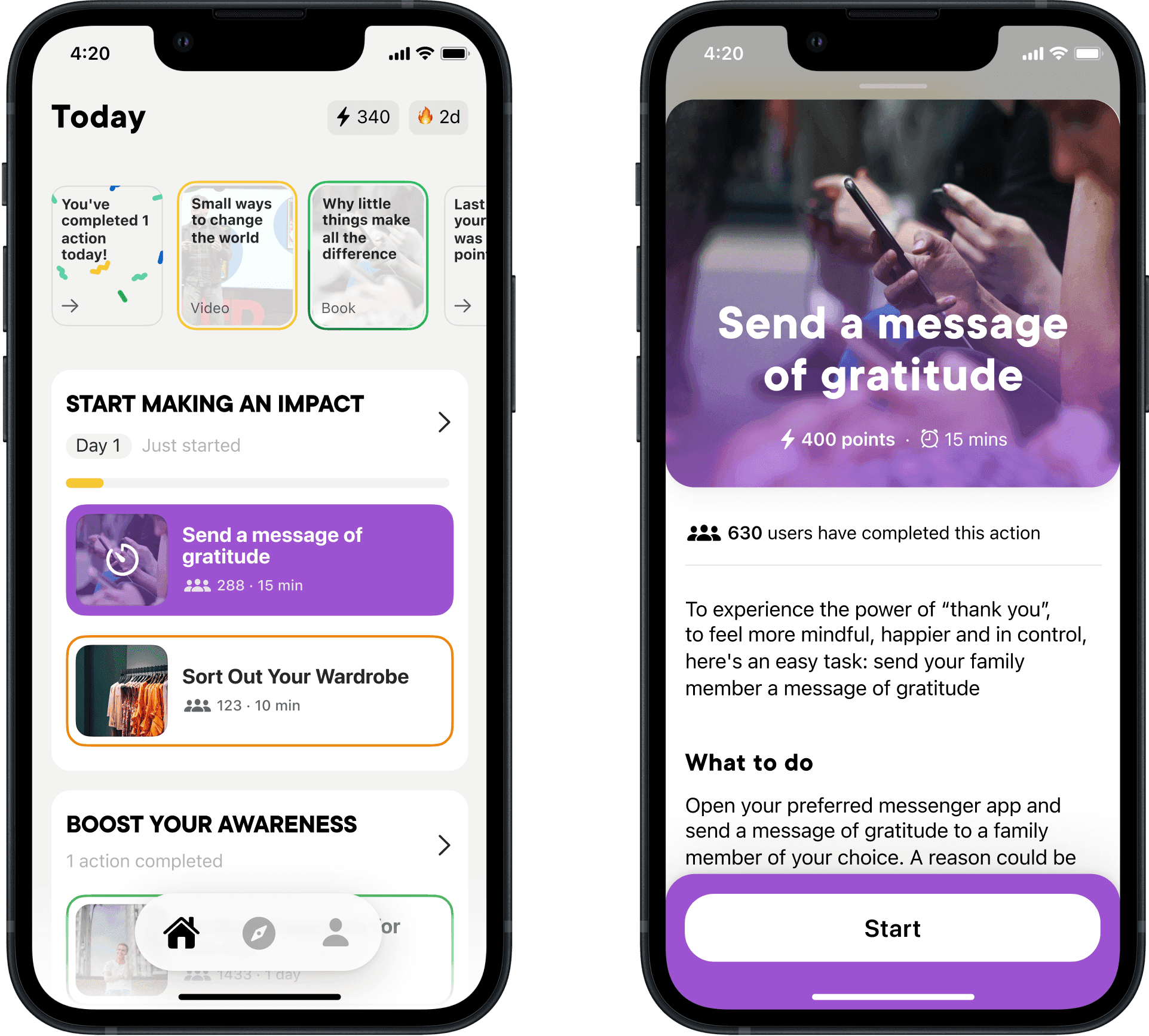
Prototype testing also showed that horizontal carousels underperformed, but the biggest issue was clarity: people couldn't tell single actions from challenge packs. To address this I moved UI to vertical scroll, and used a "box" layout to distinguish actions from packs.

We scoped the first build around challenge packs: real-world actions spread over multiple days, shareable externally. Payments and donations we initially planned got cut. Five months of runway made the scope constraints obvious, and early user tests had raised trust concerns for donations in an unknown app.

Prototype testing also showed that horizontal carousels underperformed, but the biggest issue was clarity: people couldn't tell single actions from challenge packs. To address this I moved UI to vertical scroll, and used a "box" layout to distinguish actions from packs.

We scoped the first build around challenge packs: real-world actions over multiple days, shareable externally. Payments and donations we initially planned got cut. Five months of runway made the scope constraints obvious, and early user tests had raised trust concerns for donations in a new app.

Prototype testing also showed that horizontal carousels underperformed, but the biggest issue was clarity: people couldn't tell single actions from challenge packs. To address this I moved UI to vertical scroll, and used a "box" layout to distinguish actions from packs.

We scoped the first build around challenge packs: real-world actions over multiple days, shareable externally. Payments and donations we initially planned got cut. Five months of runway made the scope constraints obvious, and early user tests had raised trust concerns for donations in a new app.

Prototype testing also showed that horizontal carousels underperformed, but the biggest issue was clarity: people couldn't tell single actions from challenge packs. To address this I moved UI to vertical scroll, and used a "box" layout to distinguish actions from packs.

Challenge and action UI after a few learnings

Challenge and action UI after a few learnings

Challenge and action UI after a few learnings

Challenge and action UI after a few learnings

Active challenge view after few learnings

Challenge and action UI after a few learnings

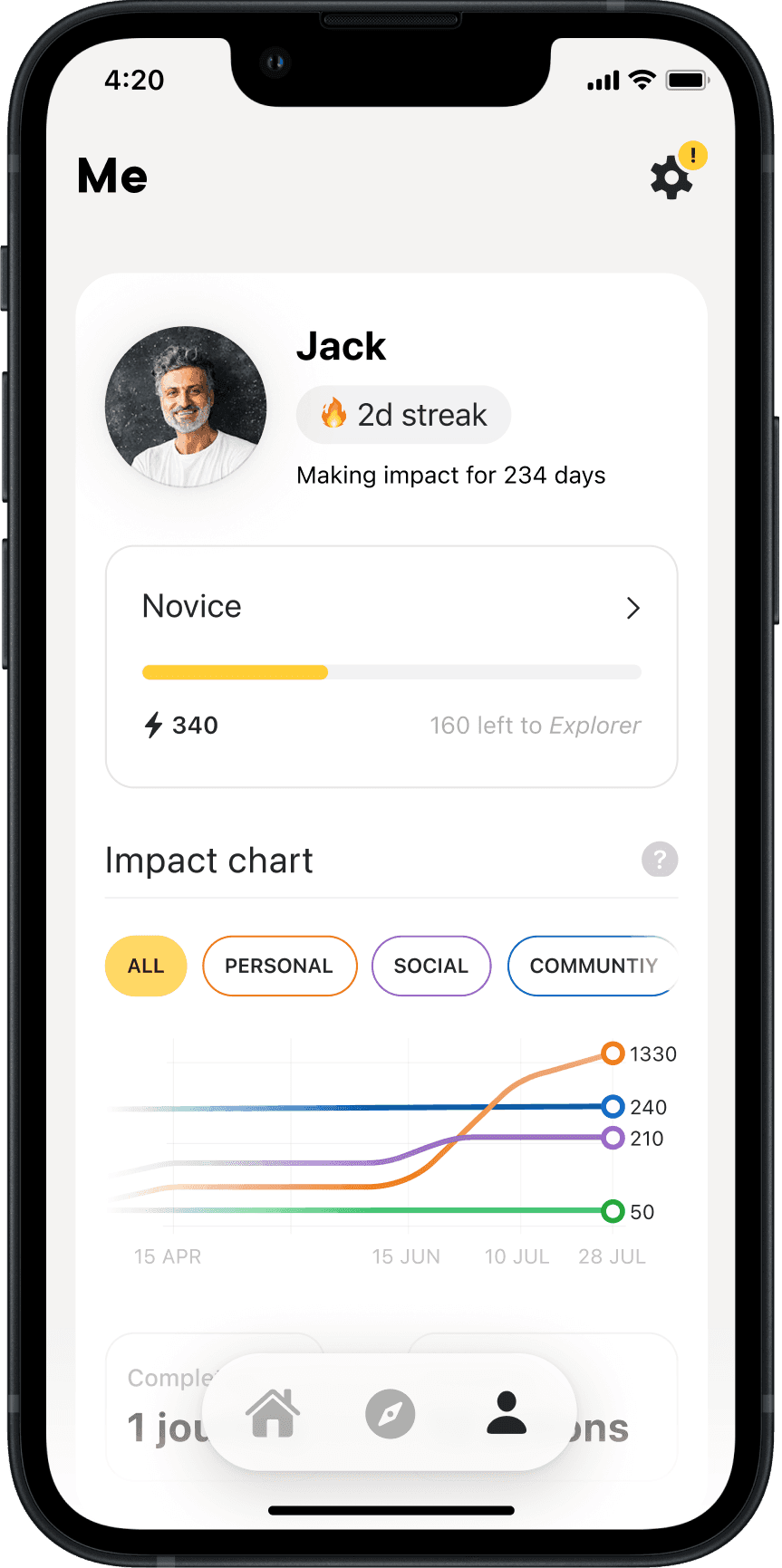
We shipped in October 2020 with 250 rich content actions. About 12k people tried it and rated it 4.7/5 from 367 ratings. Users who completed more actions early stayed longer: 61% week-one retention for highly engaged users versus 23% overall. People started strong, then drifted.

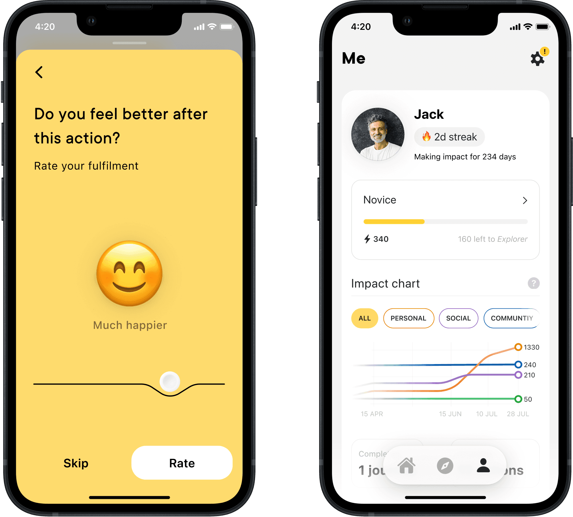
Over the next two months, we tried to fix activation and progress visibility: pulled the first action into onboarding, added points and levels, and tightened the challenge experience. Engagement nudged up, but retention didn't really move.

We shipped in October 2020 with 250 rich content actions. About 12k people tried it and rated it 4.7/5 from 367 ratings. Users who completed more actions early stayed longer: 61% week-one retention for highly engaged users versus 23% overall. People started strong, then drifted.

Over the next two months, we tried to fix activation and progress visibility: pulled the first action into onboarding, added points and levels, and tightened the challenge experience. Engagement nudged up, but retention didn't really move.

Building a sense of progress with reflection and gamification

Building a sense of progress with reflection and gamification

Building a sense of progress with reflection and gamification

Building a sense of progress with reflection and gamification

Building a sense of progress with gamification

Building a sense of progress with reflection and gamification

The tiny everyday action hypothesis worked, but true product-market fit needed more. Our next bet was that social proof and accountability could give people a much stronger reason to return, shaping the direction for V2.

Pivot to social

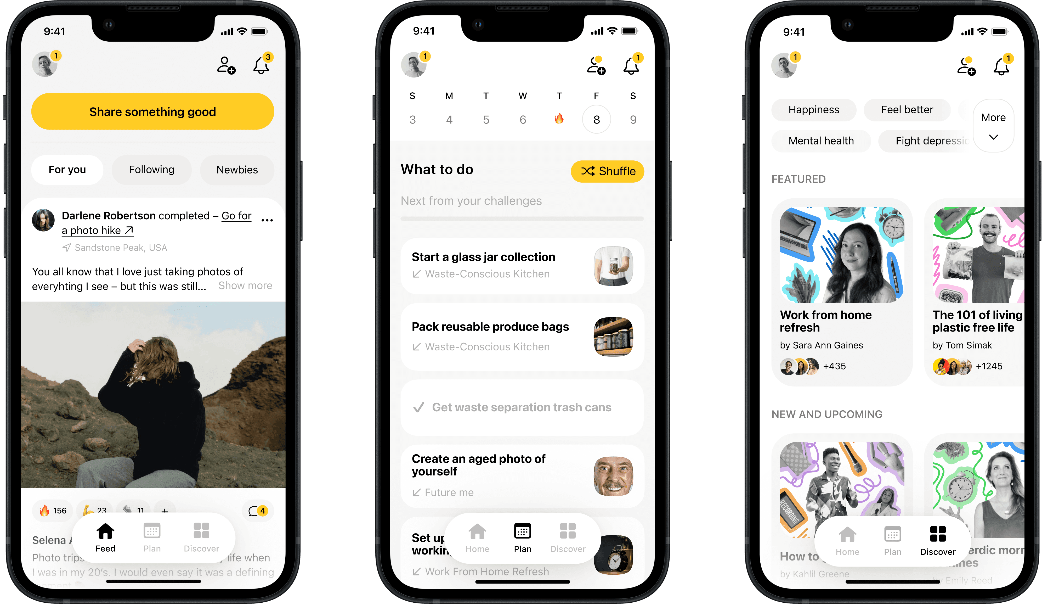
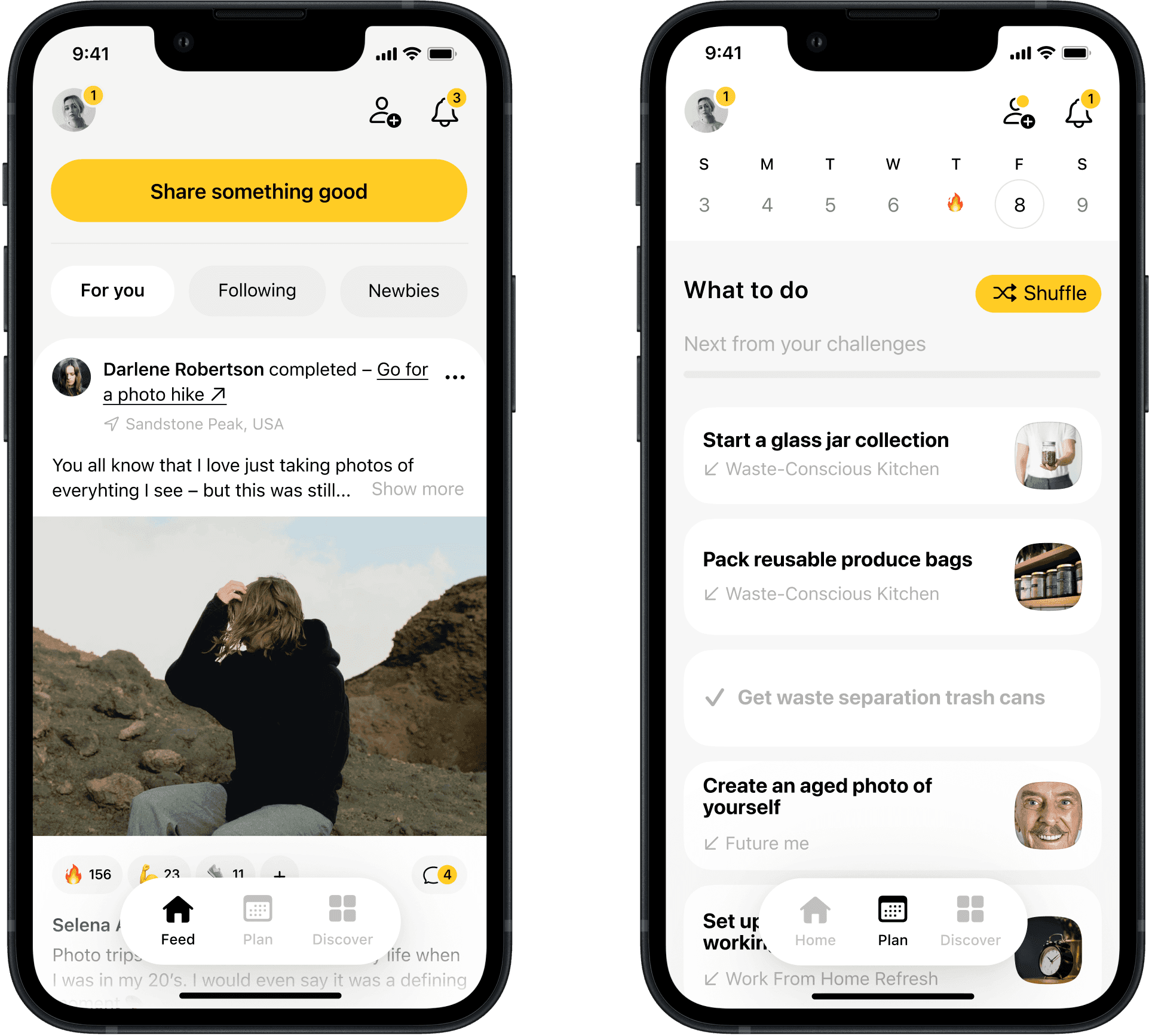
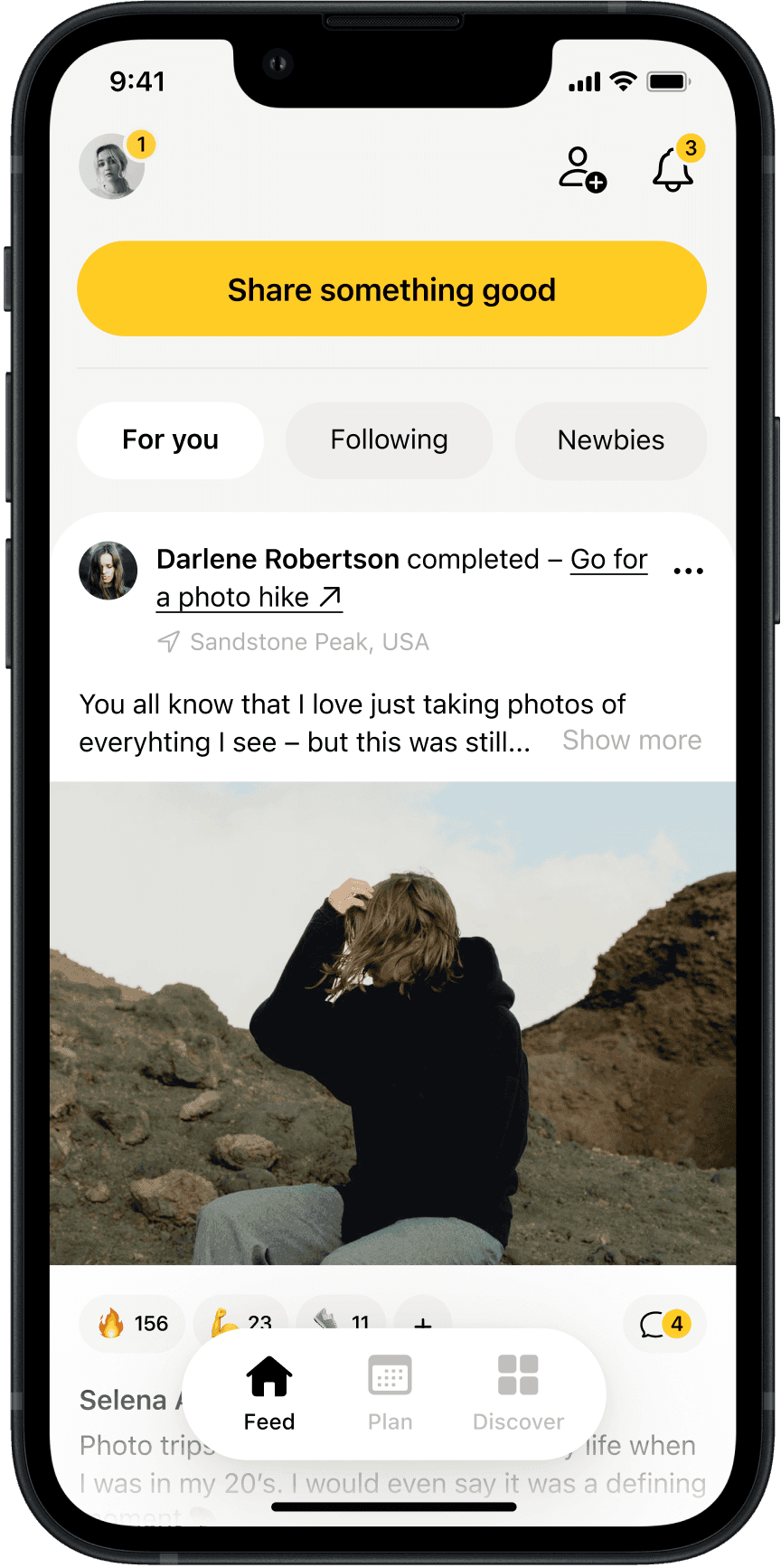
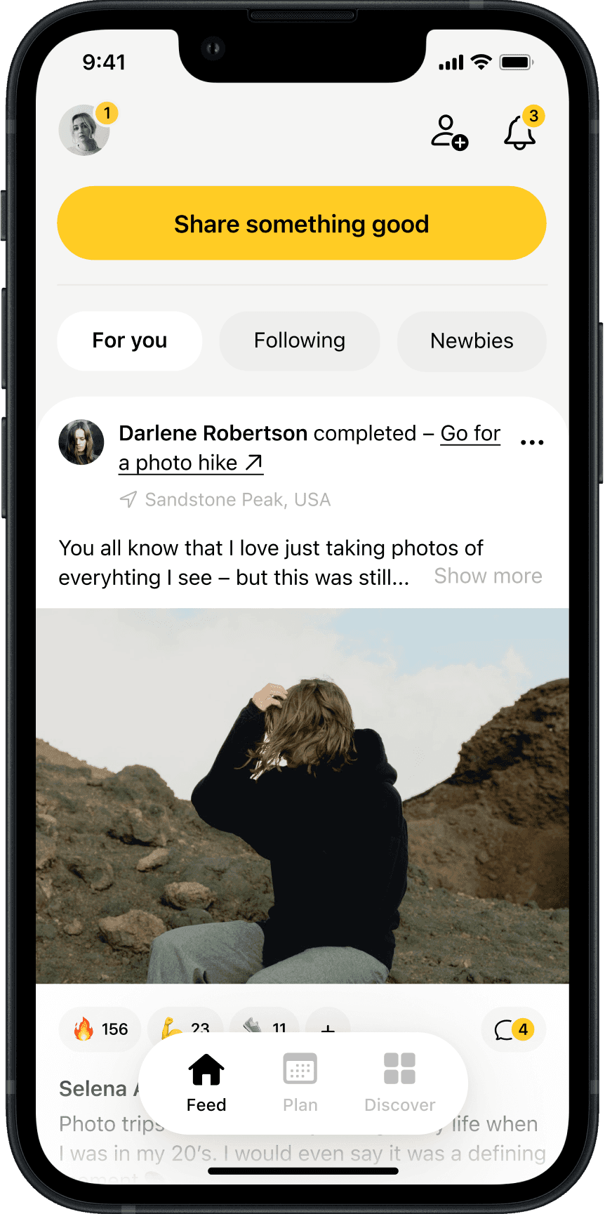
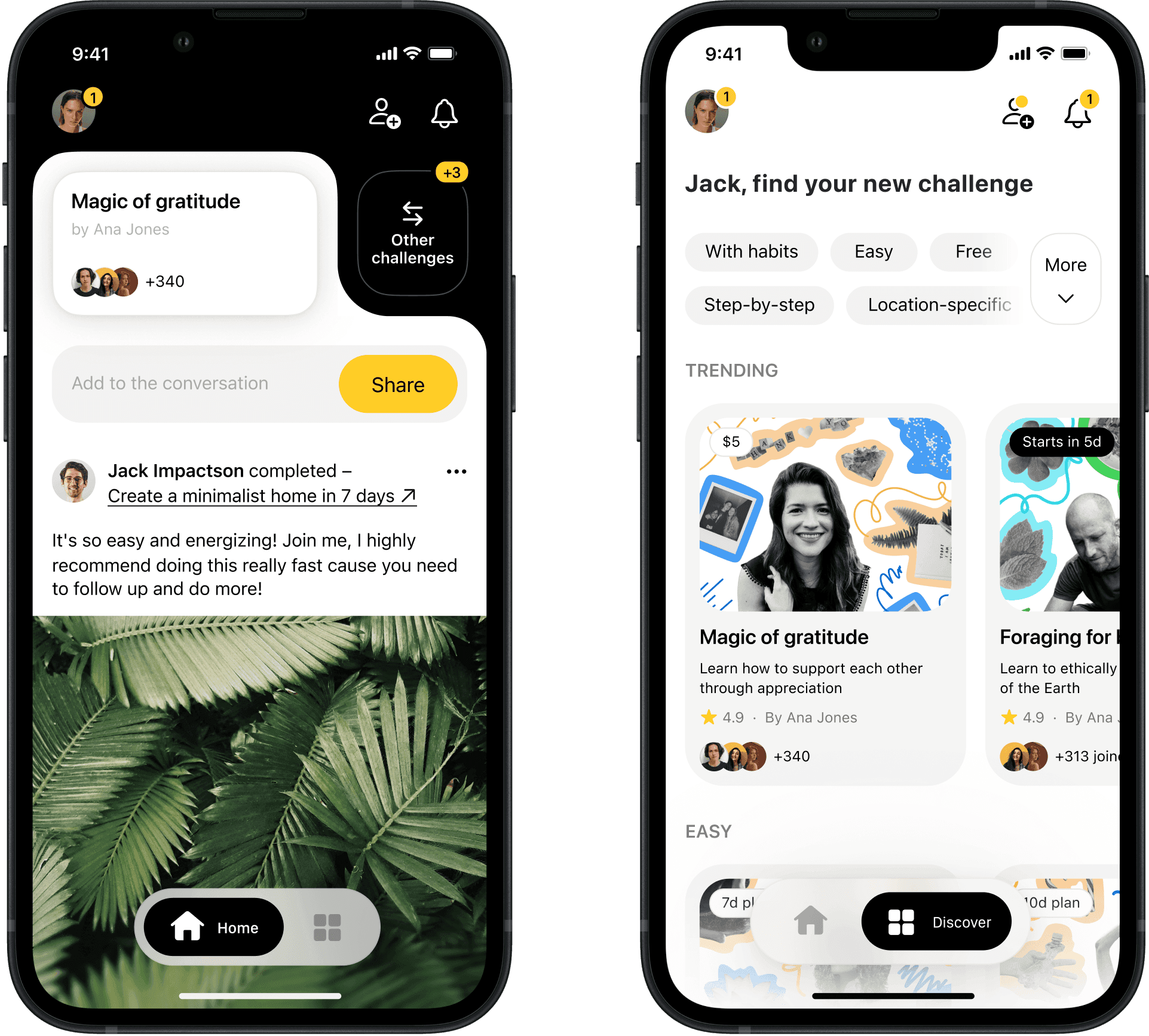
I rebuilt Alms as a vertical network where people could post what they’d done and invite others to try. The goal was a faster “see it, understand it, try it” loop. After testing layouts with users and stakeholders, I chose familiar social feed patterns instead of inventing new ones – our audience already had that muscle memory.
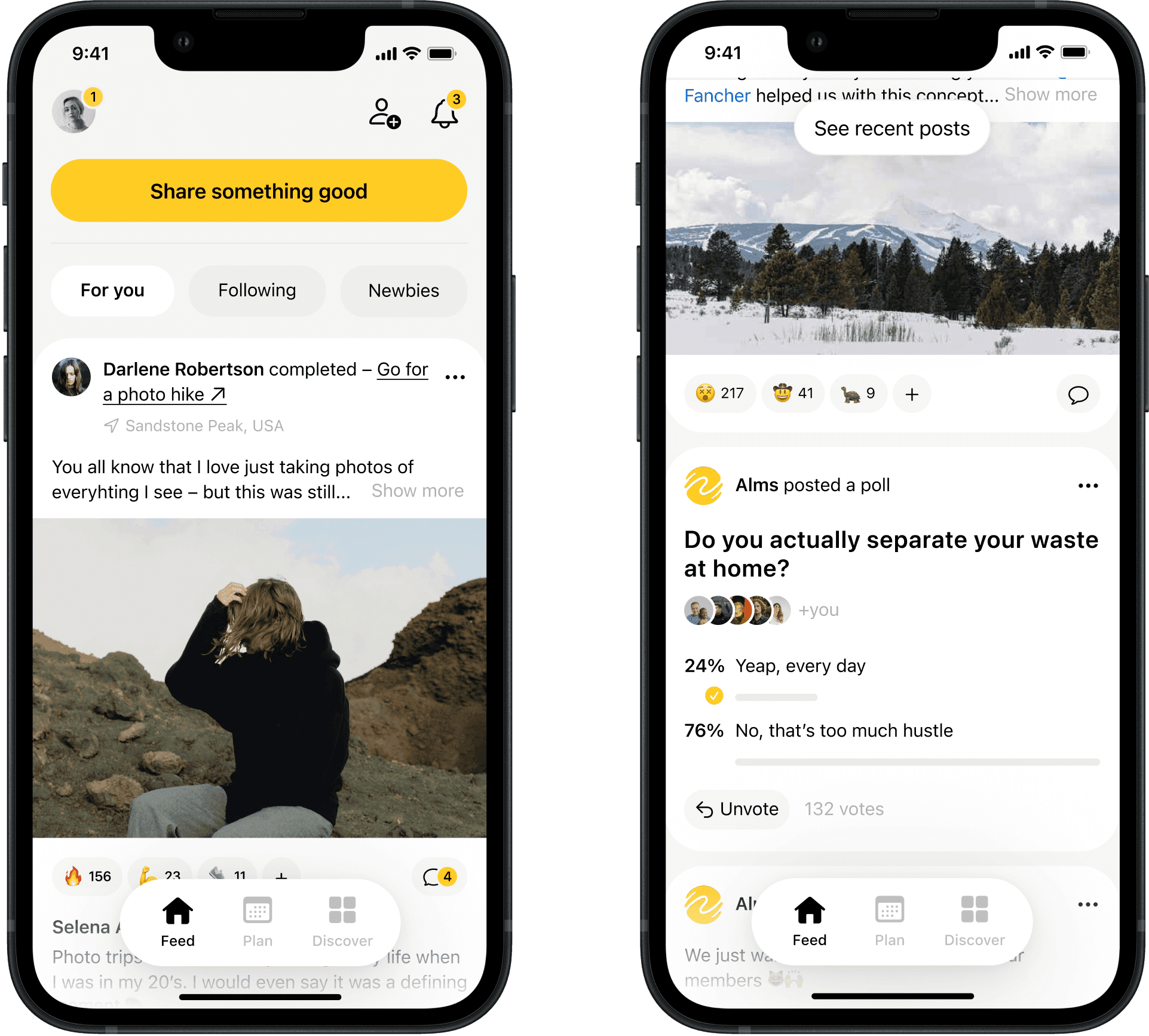
Completed actions feed in the redesigned app

Completed actions feed in the redesigned app

Completed actions feed in the redesigned app

Completed actions feed in the redesigned app

Completed actions feed in the redesigned app

Completed actions feed in the redesigned app

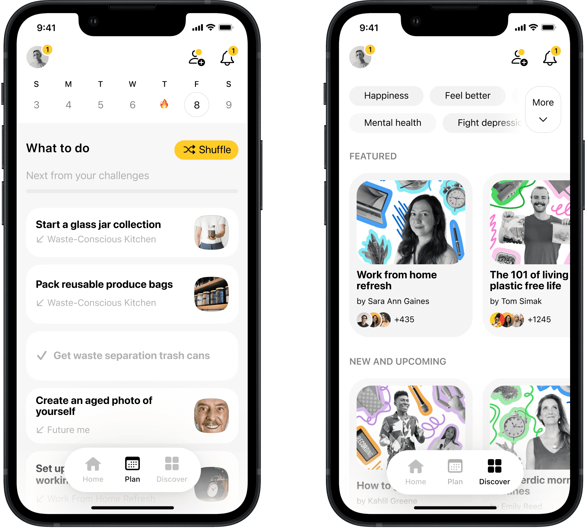
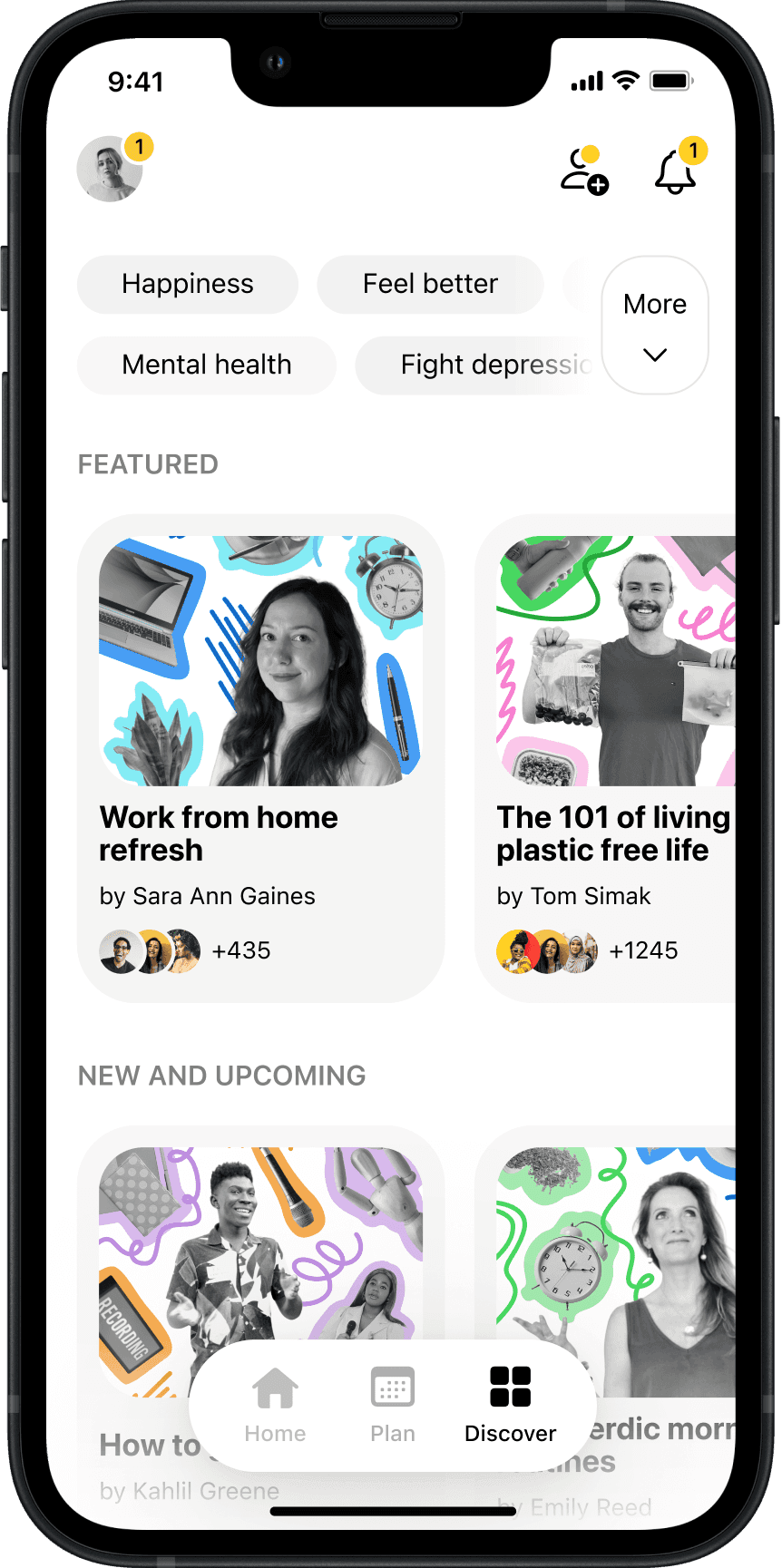
The structural change was bigger. Now you could post freeform to create repeatable actions or complete challenges that prompted sharing. As we partnered with creators to bring their audiences in, I collaborated with a graphic designer on a scalable collage covers system to signal challenge topics quickly.

Freeform posts could now become repeatable actions, while challenges gave people specific tasks to complete and share. As we brought in creators and their audiences, I worked with a graphic designer on a scalable collage cover system so each challenge topic was easy to understand at a glance.

The structural change was bigger. Now you could post freeform to create repeatable actions or complete challenges that prompted sharing. As we partnered with creators to bring their audiences in, I collaborated with a graphic designer on a scalable collage covers system to signal challenge topics quickly.

Creator-focused actions and challenges

Creator-focused actions and challenges

Creator-focused actions and challenges

Creator-focused actions and challenges

Creator-focused challenges

Creator-focused actions and challenges

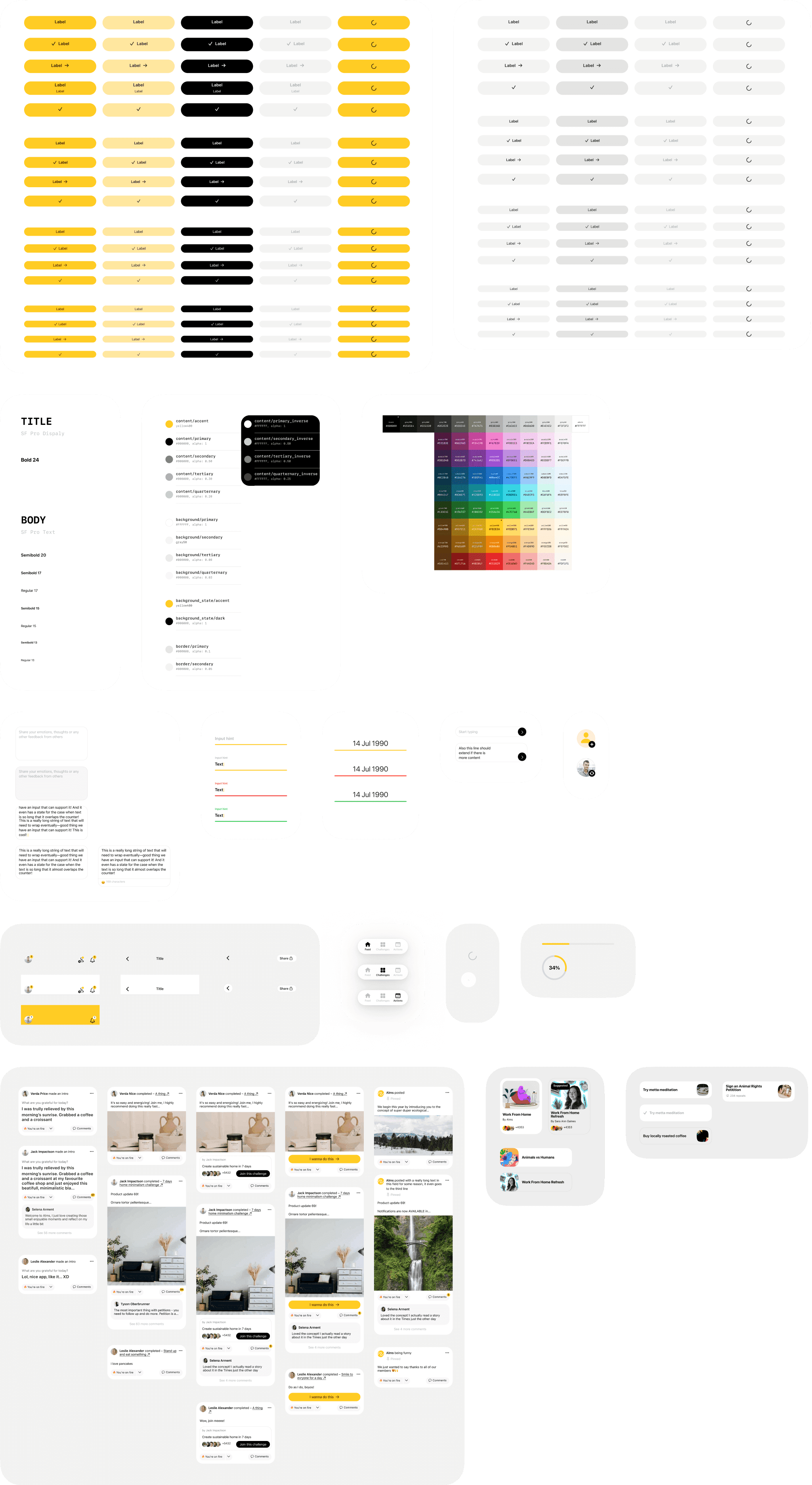
As the product grew, maintaining the needed design implementation quality started slowing the delivery of actual features and experiments. Legacy states, one-off components, and edge cases piled up into extra questions and UI inconsistencies.

I audited which components new Alms actually used, cut the noise, organized the rest into primitives and patterns, replaced one-off values with tokens, and locked spacing to 8pt. Result: fewer visual bugs in production and less back-and-forth with engineers.

As the product grew, keeping the UI quality high started slowing down feature and experiment delivery.

I sat down with engineers to check were actually used, cut the noise, organized the rest into primitives and patterns, replaced one-off values with tokens, and locked spacing to 8pt. Result: fewer visual bugs in production and less back-and-forth with engineers.

As the product grew, maintaining the needed design implementation quality started slowing the delivery of actual features and experiments. Legacy states, one-off components, and edge cases piled up into extra questions and UI inconsistencies.

I audited which components new Alms actually used, cut the noise, organized the rest into primitives and patterns, replaced one-off values with tokens, and locked spacing to 8pt. Result: fewer visual bugs in production and less back-and-forth with engineers.

A few bits from the Alms 2.0 design system

A few bits from the Alms 2.0 design system

A few bits from the Alms 2.0 design system

A few bits from the Alms 2.0 design system

A few bits from the Alms 2.0 design system

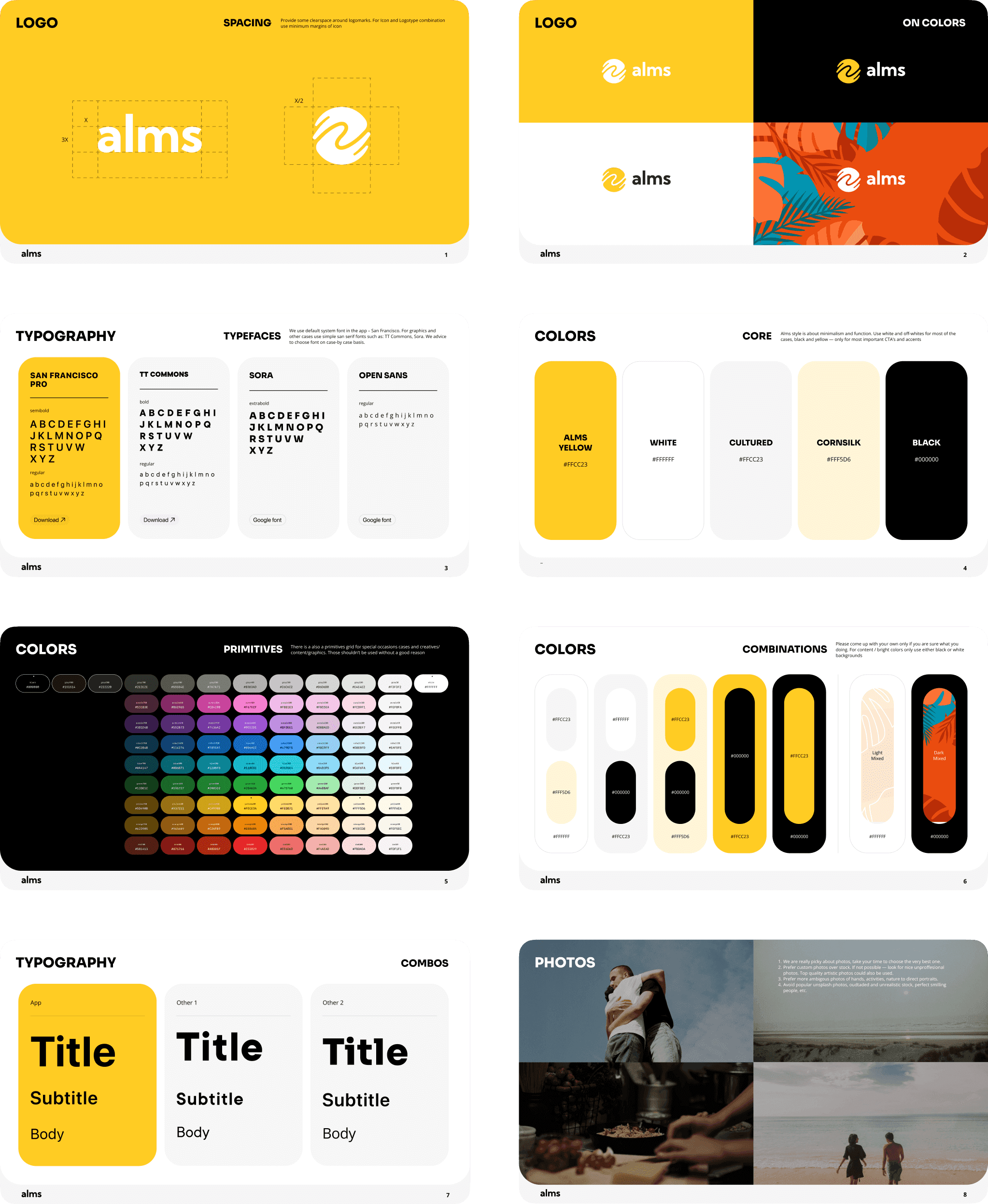
With a brand designer, I refreshed the app icon, tightened the logo, and set rules for type, motion, photography and collage covers. I packaged it into a guide so contractors could work without handoffs and made the shared libraries our single source of truth.

We worked with a logotype designer to refresh the app icon and tighten the logo. I then added rules for type, motion, photography, and collage covers, and turned them into a simple guide so contractors could work without extensive handoffs.

With a brand designer, I refreshed the app icon, tightened the logo, and set rules for type, motion, photography and collage covers. I packaged it into a guide so contractors could work without handoffs and made the shared libraries our single source of truth.

Alms 2.0 style guide for contractors

Alms 2.0 style guide for contractors

Alms 2.0 style guide for contractors

Alms 2.0 style guide for contractors

Alms 2.0 style guide for contractors

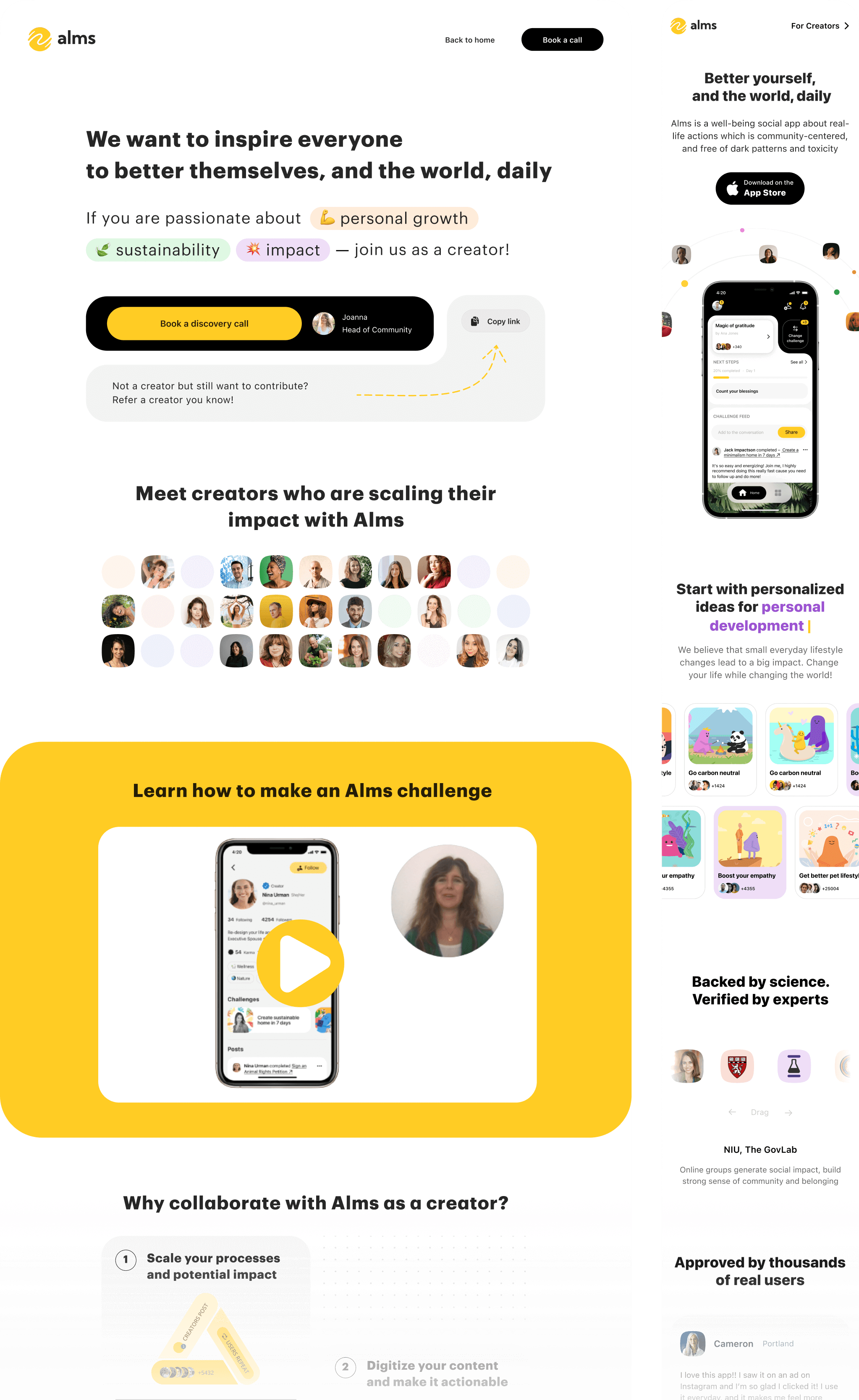
I rebuilt the web presence too. Landing page for users: what Alms is, how it works, proof, and download. For creators: a page explaining how to host with examples and benefits.

Creator and user landing pages

Creator and user landing pages

Creator and user landing pages

Creator and user landing pages

Creator and user landing pages

Working with 50+ creators, we doubled downloads from 12k to 25k and grew the Facebook community from ~500 to ~900. Distribution worked. Community interest worked. But the feed didn’t create enough participation to sustain the model on its own: 62% of users browsed, 30% engaged, and only 8% posted.

The diagnosis: creators could bring people in, but we were still asking users to do too much. Most people wanted to browse instead of post, while the challenge format was too static to be engaging as content on its own. To make creators a stronger reason to stay, we needed a more modular system with lighter participation and faster wins.

Platform vision

Creator strategy success meant turning Alms into a platform where anyone could build and run challenges. One additional problem: the general feed couldn't balance relevance with discovery, leaving new users confused.

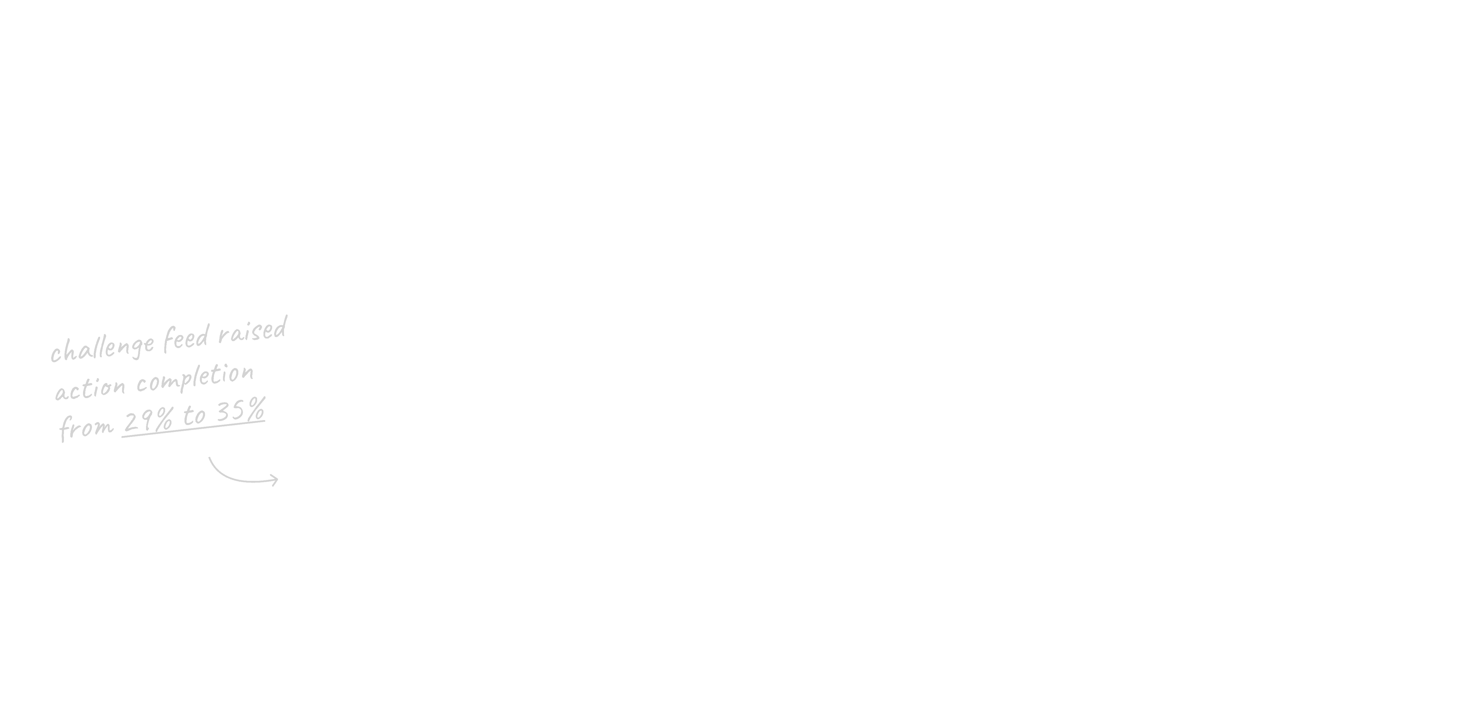
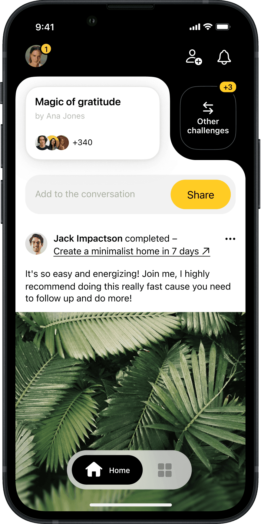
While preparing the V3 pitch, we tested ideas early. One change: challenge-specific sub-feeds instead of one mixed feed. This moved first-action completion from 29% to 35%. Small lift, but it proved the principle – better challenge structure could make this bet work.

Challenge sub feeds and improved explore

Challenge sub feeds and improved explore

Challenge sub feeds and improved explore

Challenge sub feeds and improved explore

Challenge sub-feeds concept

Challenge sub feeds and improved explore

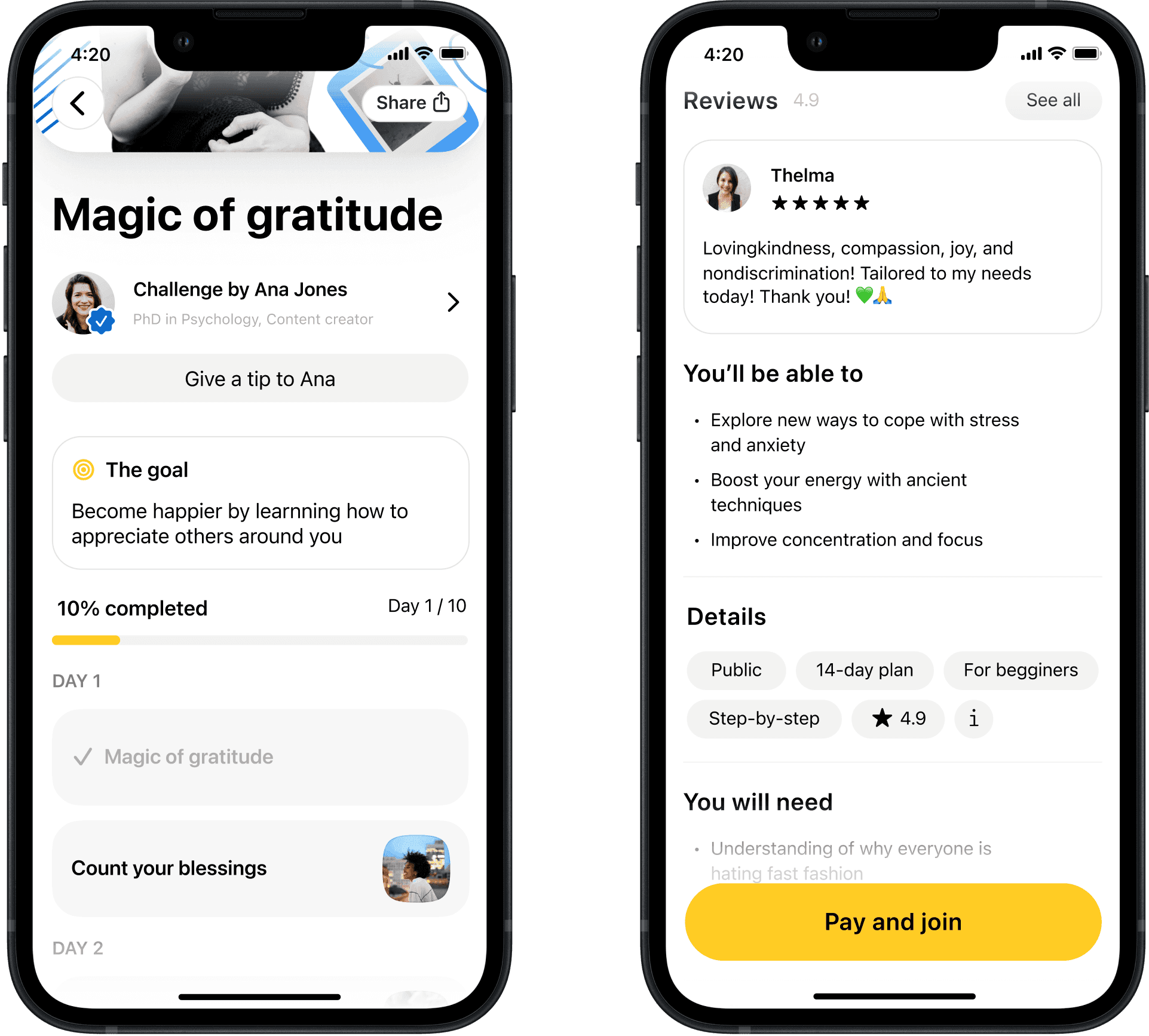
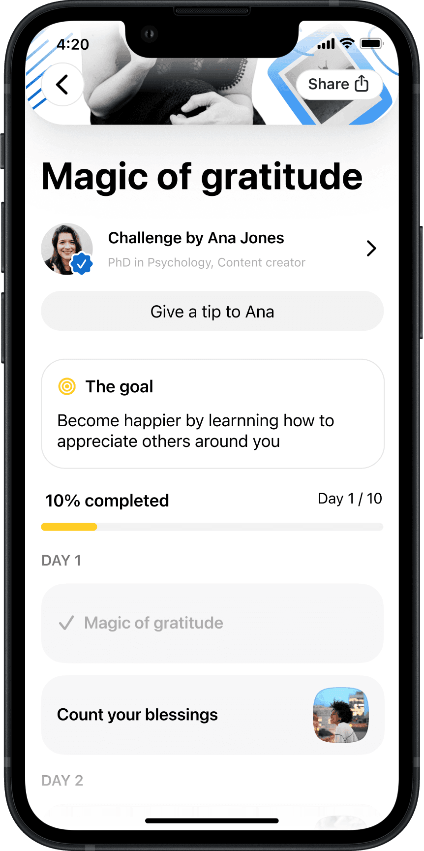
Most importantly for new version, we looked at what course platforms offered that we didn't. Key ideas: preview with reviews, clear day-by-day structure, creator profiles with tipping, progress tracking, and richer formats like video and stories. All broken into quick steps around small wins. We prototyped with creators to test what resonated.

For the new concept, we studied what course platforms did better than us: previews with reviews, clear day-by-day structure, creator profiles with tipping, progress tracking, and richer formats like vertical video and stories – all broken into quick steps around small wins. We prototyped those ideas with creators to see what resonated.

Most importantly for new version, we looked at what course platforms offered that we didn't. Key ideas: preview with reviews, clear day-by-day structure, creator profiles with tipping, progress tracking, and richer formats like video and stories. All broken into quick steps around small wins. We prototyped with creators to test what resonated.

Modular course-like challenges based on creators' requests

Modular course-like challenges based on creators' requests

Modular course-like challenges based on creators' requests

Modular course-like challenges based on creators' requests

Modular course-like challenges based on creators' requests

Modular course-like challenges based on creators' requests

Sadly, Palta didn't fund the next round and the exploration was cut short. The creator-payment model we proposed didn't fit their subscription-focused strategy. Looking back, ending it honestly was the right call. We had given it two years and learned what mattered most.

Sadly, Palta didn't fund the next round and our exploration was cut short. The creator-payment model we proposed didn't fit their subscription-focused strategy. Looking back, ending it there was the right call. We had given it two years and learned what mattered most.

Sadly, Palta didn't fund the next round and the exploration was cut short. The creator-payment model we proposed didn't fit their subscription-focused strategy. Looking back, ending it honestly was the right call. We had given it two years and learned what mattered most.

Conclusion

Downloads

25k

App store

Retention

61%

Activated users, W1

Alms showed real demand and strong quality signals. People converted above category benchmarks, rated the app well, power users came back, and the idea was strong enough to get covered by TechCrunch. But we didn’t prove fast enough that offline daily habits could support a venture-backed subscription business.

What stayed with me is product-design essentialism. Craft and speed are only in conflict when you're working on the wrong things. Once you're clear on what matters, polish becomes the natural output, not a tax on it. Design systems and pixel-perfect work are leverage when they make the work easier, and naturally take a back seat when they don’t.

I'm proud of how far we pushed the app idea and how much it changed the way I design.

Alms showed real demand and strong quality signals: people converted above category benchmarks, rated the app well, and power users came back. We found where the promise was real, but didn’t prove fast enough that offline daily habits could support a venture-backed subscription business.

What stayed with me is product-design essentialism. Craft and speed are only in conflict when you're working on the wrong things. Once you're clear on what matters, polish becomes the natural output, not a tax on it.

I'm proud of how far we pushed the app idea and how much it changed the way I design.

Alms showed real demand and strong quality signals. People converted above category benchmarks, rated the app well, power users came back, and the idea was strong enough to get covered by TechCrunch. But we didn’t prove fast enough that offline daily habits could support a venture-backed subscription business.

What stayed with me is product-design essentialism. Craft and speed are only in conflict when you're working on the wrong things. Once you're clear on what matters, polish becomes the natural output, not a tax on it. Design systems and pixel-perfect work are leverage when they make the work easier, and naturally take a back seat when they don’t.

I'm proud of how far we pushed the app idea and how much it changed the way I design.

Acknowledgements

Built with love from Minsk with Alex Nevedovsky, Sasha Khadeka, Nick Shchetko, Sofia Chop, Joanna Buchmeyer, Roman Kutanov, Andrei Lunevich, Sergei Borovkov, and Dzianis Nikitsin. Thanks to everyone who cared, tested, and gave advice along the way. Alex – thank you for seeing my potential early.