Simple – AI food tracking

11 Apr, 2022

As the first designer at Palta-backed Alms, I took the product from zero to first release in five months, led redesign through two pivots, and owned everything from onboarding and core flows to design system, brand and landings.

Timeline

2020–2022

Role

Founding Designer

Scope

UX/UI, Design System, Brand

Product

0

1

, B2C, Wellness

Surfaces

iOS, Landing

Alms was a social-impact wellness app funded by Palta (Flo Health, Simple, Lensa, etc). It helped people feel better through small real life actions, like helping others or building healthier habits.

Over two years it moved through three models: personal challenges, social network, and creator-led platform. The audience was 30–40+ already paying for apps like Headspace and Calm, and the final direction used creators as the distribution layer to bring them in at scale.

Simple started as a fasting timer — strong category leader, 15M+ downloads, narrow product. The growth question was clear: what comes after the fast?

Food logging was the obvious next layer. It could anchor daily engagement, generate the personalization data the rest of the product needed, and build nutrition credibility that fasting alone couldn't carry. By Q1 2024, the company-level key result was explicit: food feedback had to be ready to drive a new habit by Q2.

But Simple's users weren't calorie counters. They didn't want MyFitnessPal-style admin. They wanted a healthier version of how they already ate. The brief sat between two things that don't usually go together: make food logging useful enough to matter, light enough that people actually keep doing it.

The challenge

Pandemic isolation made people want to feel better and more connected. The hard part? That kind of behaviour happens offline, where friction is high and progress is invisible. Our goal was to connect people online in a meaningful way and make their self-improvement progress visible.

The challenge

Pandemic isolation made people want to feel better and more connected. The hard part? That kind of behaviour happens offline, where friction is high and progress is invisible. Our goal was to connect people online in a meaningful way and make their self-improvement progress visible.

The challenge

Pandemic isolation made people want to feel better and more connected. The hard part? That kind of behaviour happens offline, where friction is high and progress is invisible. Our goal was to connect people online in a meaningful way and make their self-improvement progress visible.

Exploration

The food database was the bottleneck. UXR was blunt about it: users couldn't find what they ate, search lacked autocorrect, and the act of "building a meal" reinforced the feeling that tracking was tedious and not for them.

I explored the system around it — daily progress, meal timelines, nutrition tips, post-log recommendations, lightweight feedback moments. Different shapes of the same question: could the loop become valuable enough that input friction stopped killing the habit?
Early food feedback and journal experiments

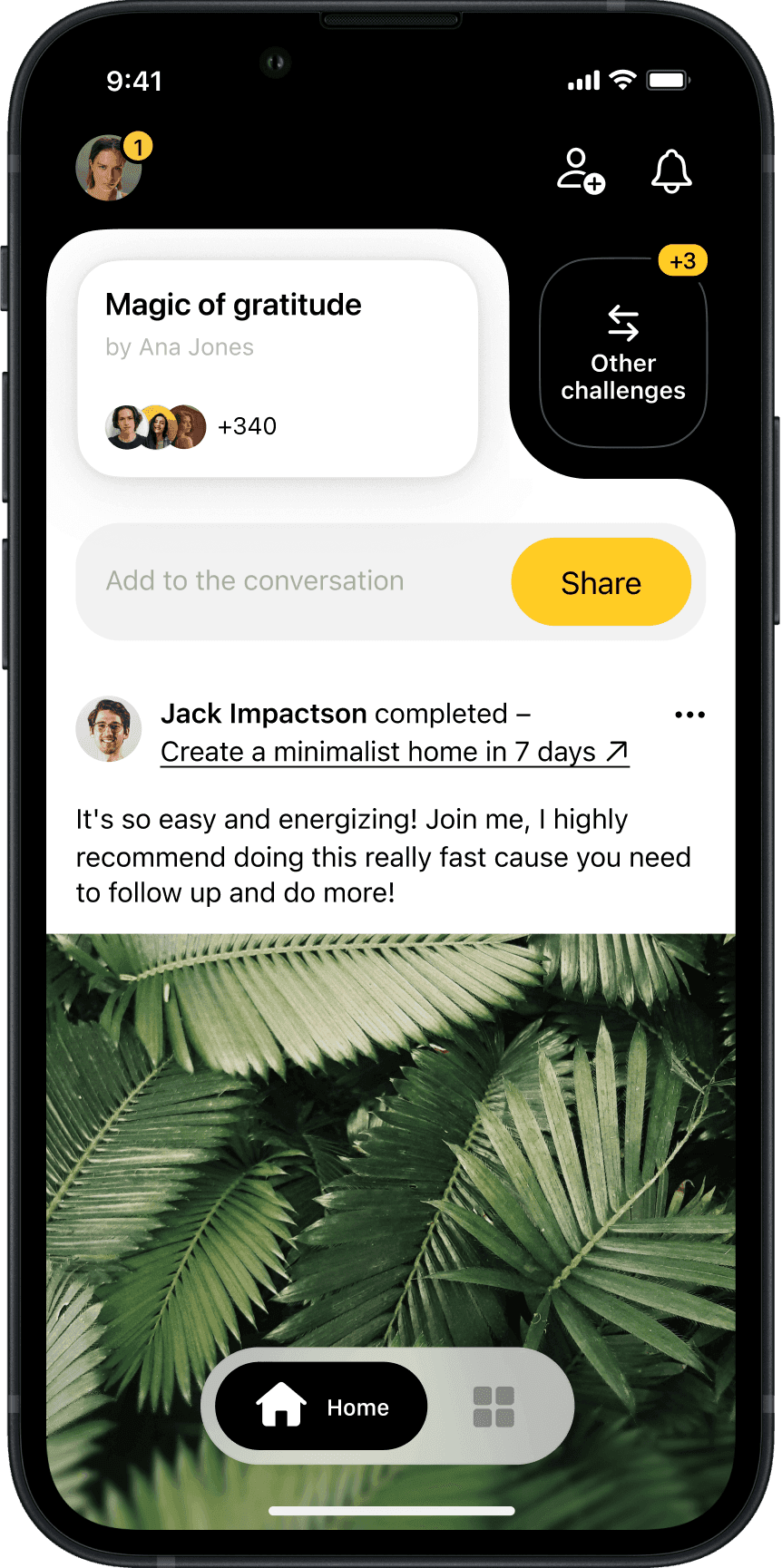
Our first take on challenges

Early food feedback and journal experiments

Early food feedback and journal experiments

Early food feedback and journal experiments

Eighteen months of small, reactive experiments moved retention by only 1–2%. The exploration isn't a trophy wall. It's a snapshot of a team learning that incremental fixes to a database-first model weren't going to be enough.
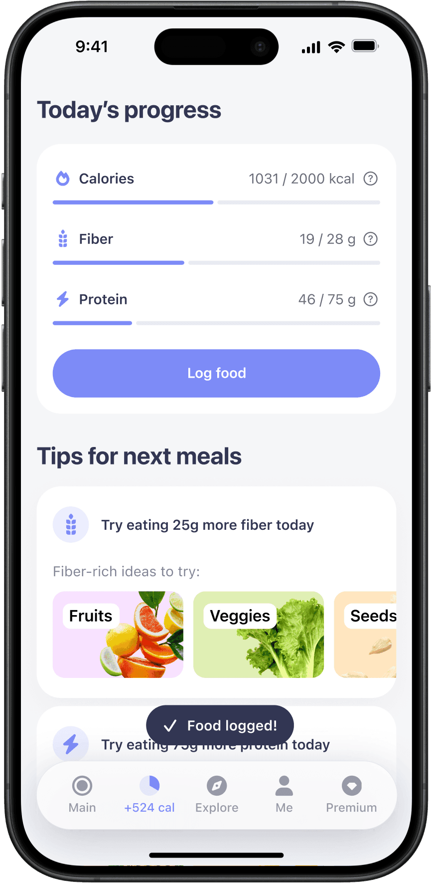

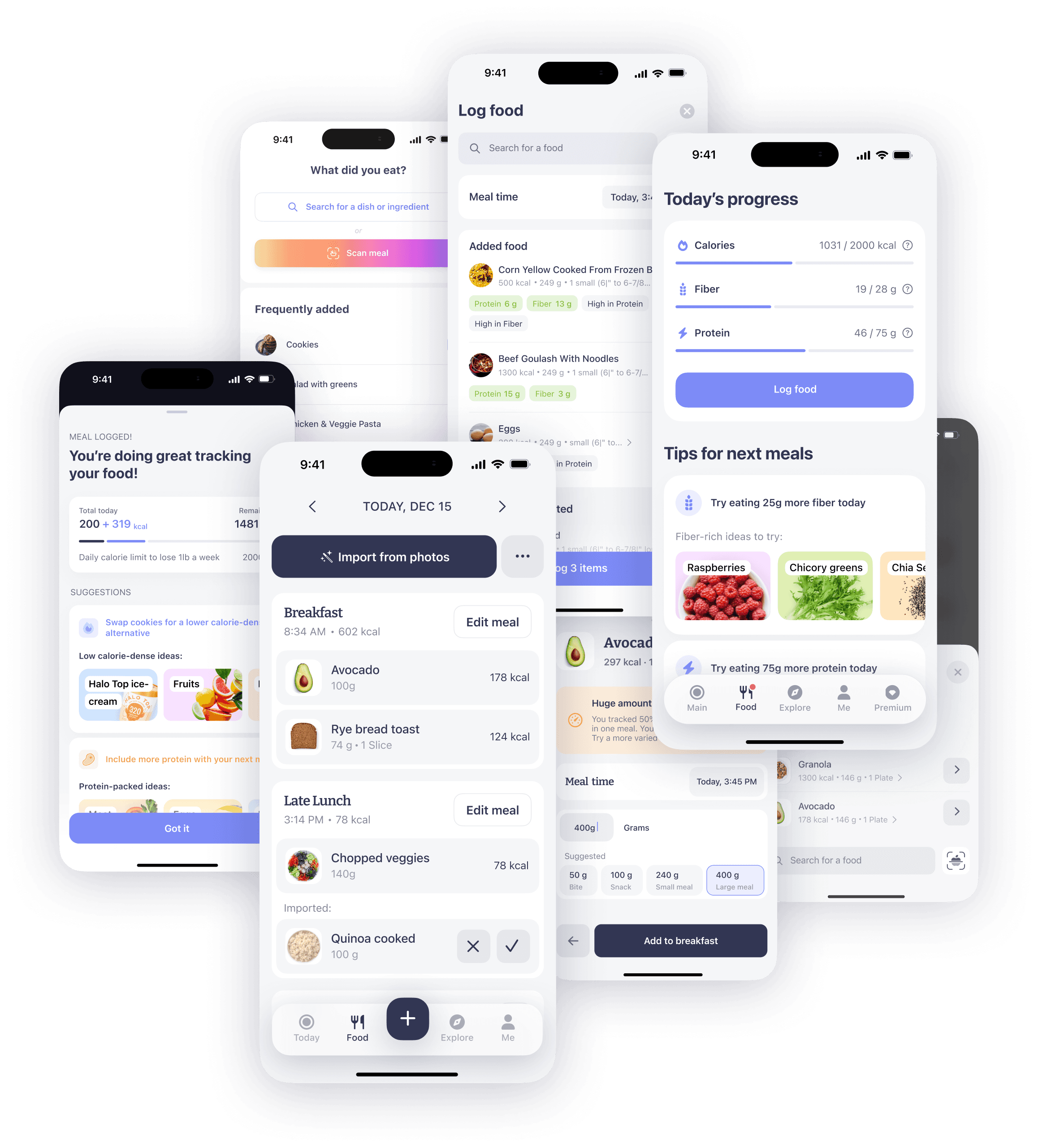
Final database food feedback we shipped

Final database food feedback we shipped

Our first take on challenges

Final database food feedback we shipped

Final database food feedback we shipped

Final database food feedback we shipped

Making the input effortless

By early 2023, AI was good enough for a different bet. Instead of trying to build a better food database than MyFitnessPal, we decided to stop making users think like a database at all.

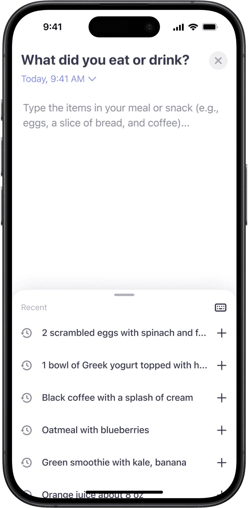
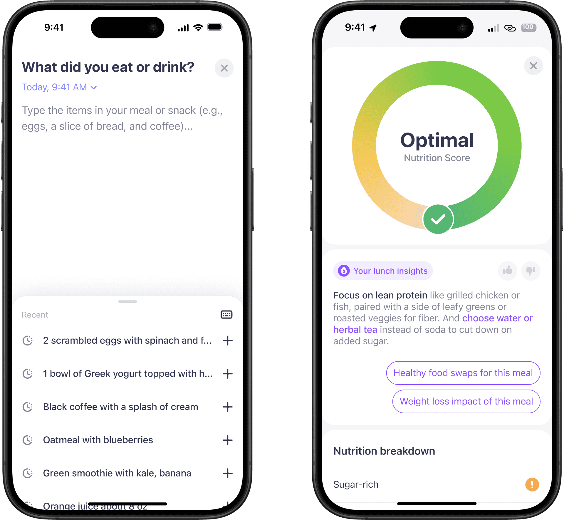
The new noting tracker I designed let people type or speak what they ate in normal language — then turned that into a structured entry the in-house feedback system could actually score. UXR landed where the design did: "Users perceived taking notes as easy and simple way of logging." A sentence-starter in the input field made the moment feel even lighter.
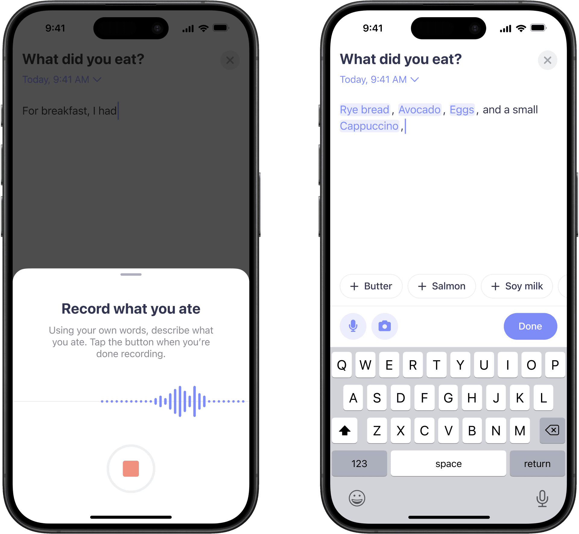
Voice input and first iteration of noting tracker

Voice input and first iteration of noting tracker

Our first take on challenges

Voice input and first iteration of noting tracker

Voice input and first iteration of noting tracker

Voice input and first iteration of noting tracker

Noting tracker V1 shipped Spring 2023 as the default flow on iOS and Android, including DE and FR. Between July 2022 and July 2023, total meal tracks grew 33% YoY — from 674k to 901k.

The honest read: the system metric moved, the habit metric didn't quite compound. The experiment wasn't conclusive on retention. We shipped it anyway because directionally it was the right reset — and because the deeper habit problem clearly needed more than a lighter keystroke.

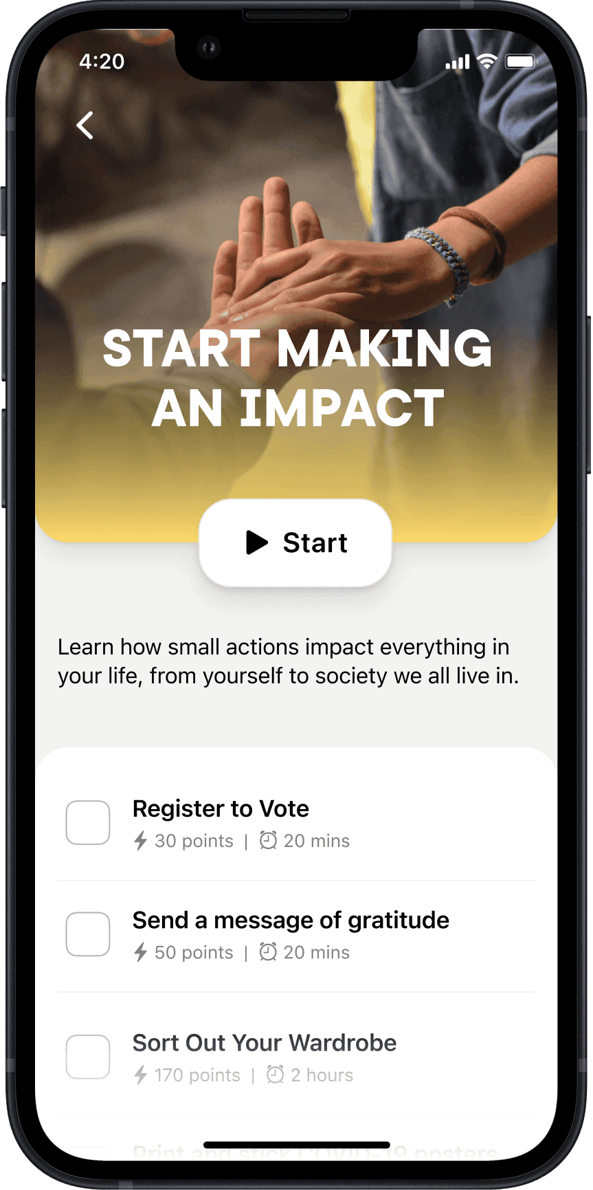
We scoped the first build around challenge packs: real-world actions spread over multiple days, shareable externally. Payments and donations we initially planned got cut. Five months of runway made the scope constraints obvious, and early user tests had raised trust concerns for donations in an unknown app.

Prototype testing also showed that horizontal carousels underperformed, but the biggest issue was clarity: people couldn't tell single actions from challenge packs. To address this I moved UI to vertical scroll, and used a "box" layout to distinguish actions from packs.

We scoped the first build around challenge packs: real-world actions over multiple days, shareable externally. Payments and donations we initially planned got cut. Five months of runway made the scope constraints obvious, and early user tests had raised trust concerns for donations in a new app.

Noting tracker V1 shipped Spring 2023 as the default flow on iOS and Android, including DE and FR. Between July 2022 and July 2023, total meal tracks grew 33% YoY — from 674k to 901k.

The honest read: the system metric moved, the habit metric didn't quite compound. The experiment wasn't conclusive on retention. We shipped it anyway because directionally it was the right reset — and because the deeper habit problem clearly needed more than a lighter keystroke.

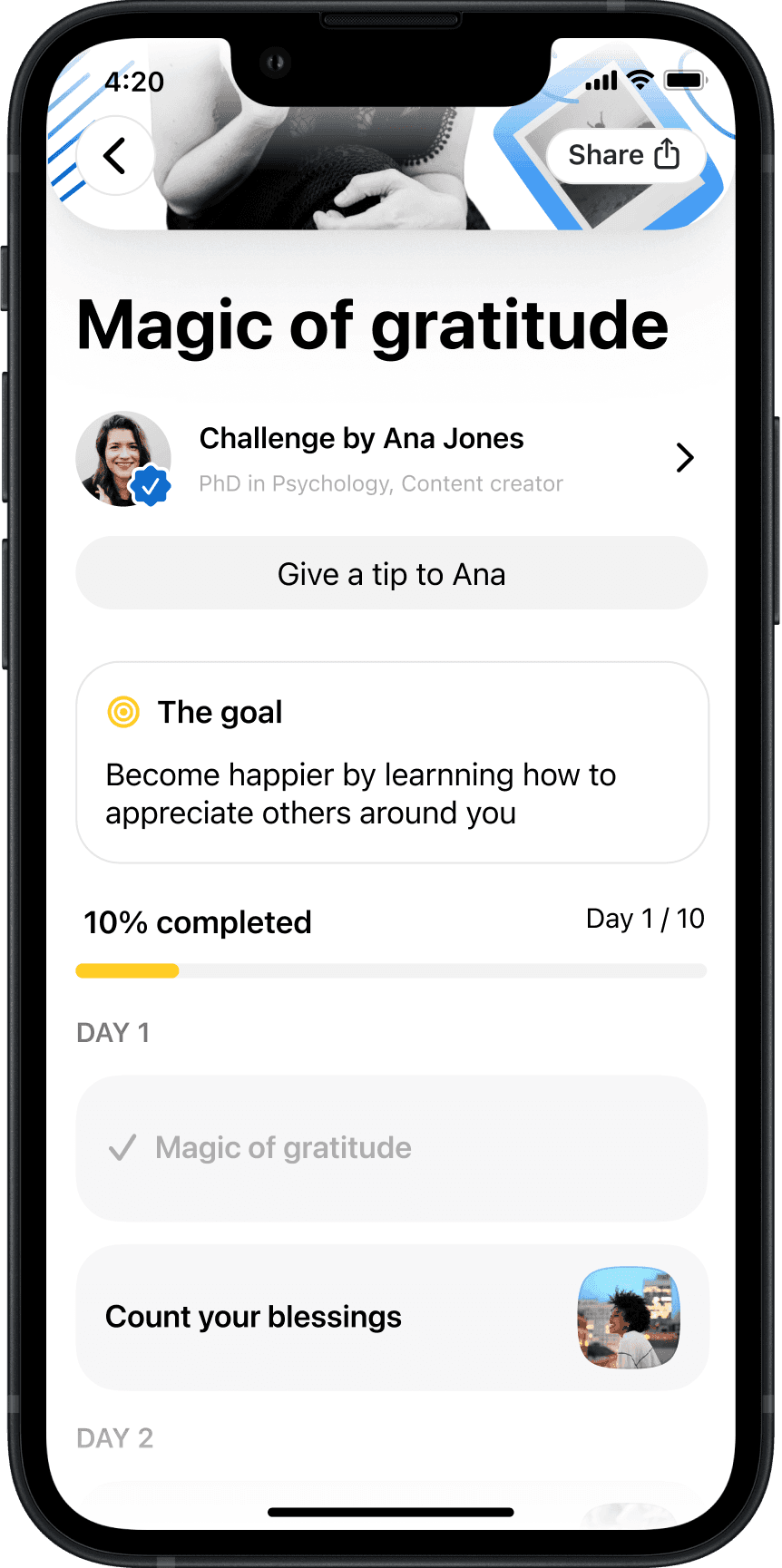
Each challenge contains actions

Each challenge contains actions

Prototype testing also showed that horizontal carousels underperformed, but the biggest issue was clarity: people couldn't tell single actions from challenge packs. To address this I moved UI to vertical scroll, and used a "box" layout to distinguish actions from packs.

We shipped in October 2020 with 250 rich content actions. About 12k people tried it and rated it 4.7/5 from 367 ratings. Users who completed more actions early stayed longer: 61% week-one retention for highly engaged users versus 23% overall. People started strong, then drifted.

Over the next two months, we tried to fix activation and progress visibility: pulled the first action into onboarding, added points and levels, and tightened the challenge experience. Engagement nudged up, but retention didn't really move.

Making food tracking worth it

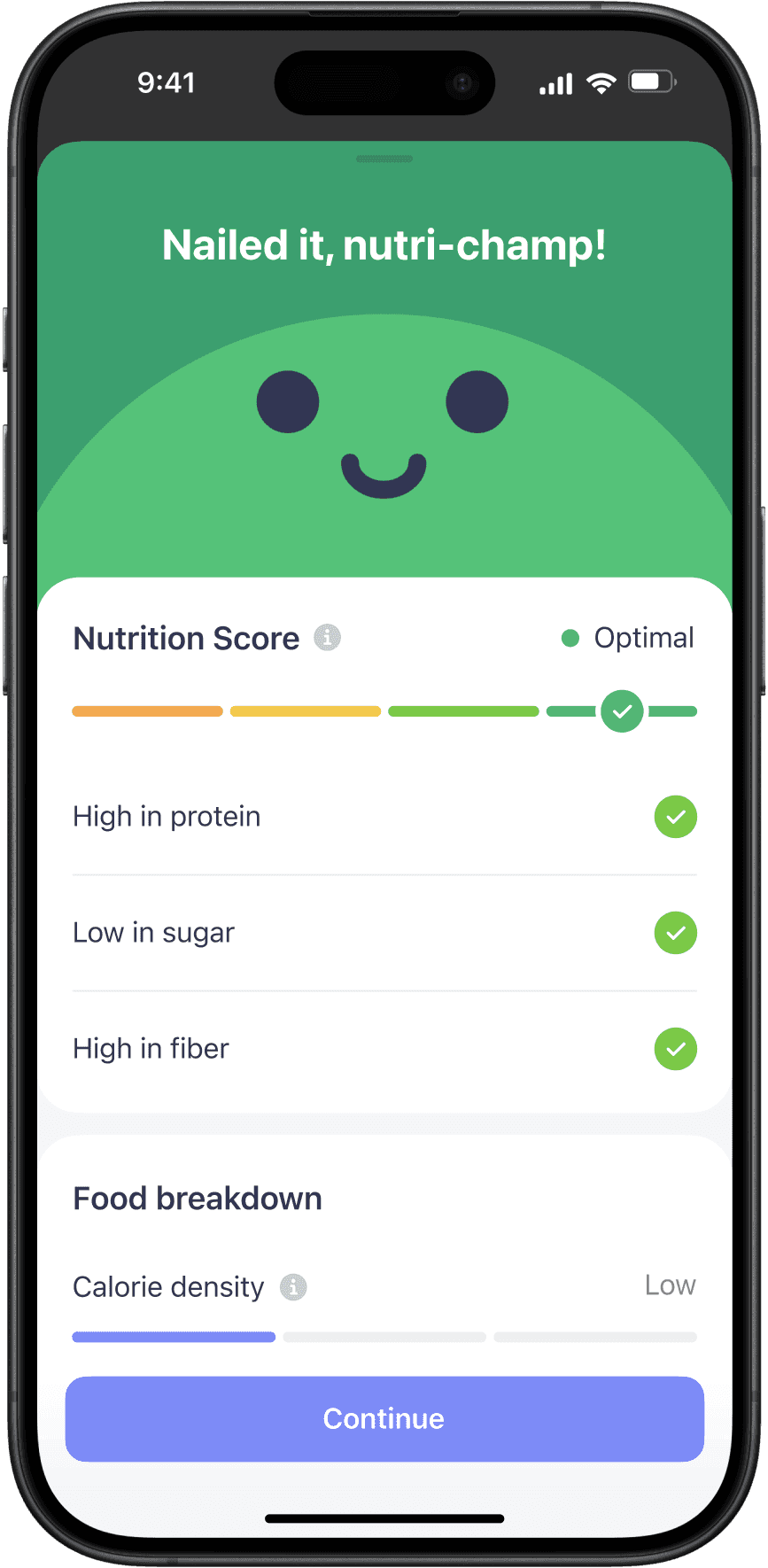
The noting tracker solved input. It didn't solve the reward. After logging, users hit a wall of macros and nutrient bars — technically correct, practically useless. UXR landed the point clearly: "When it comes to food you want to have a feeling of comfort." People didn't want to calculate. They wanted to know how the meal landed.

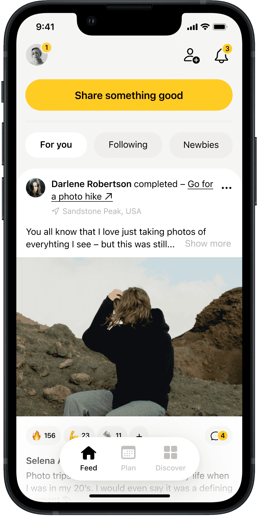
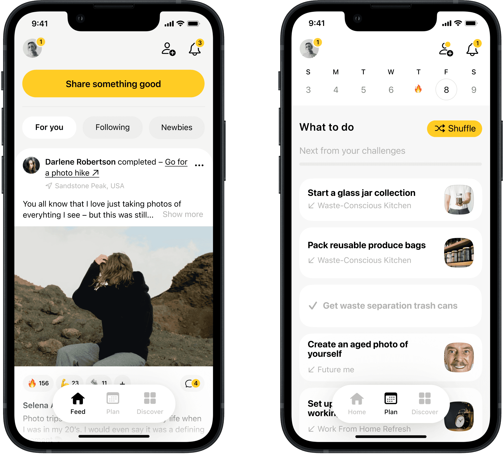
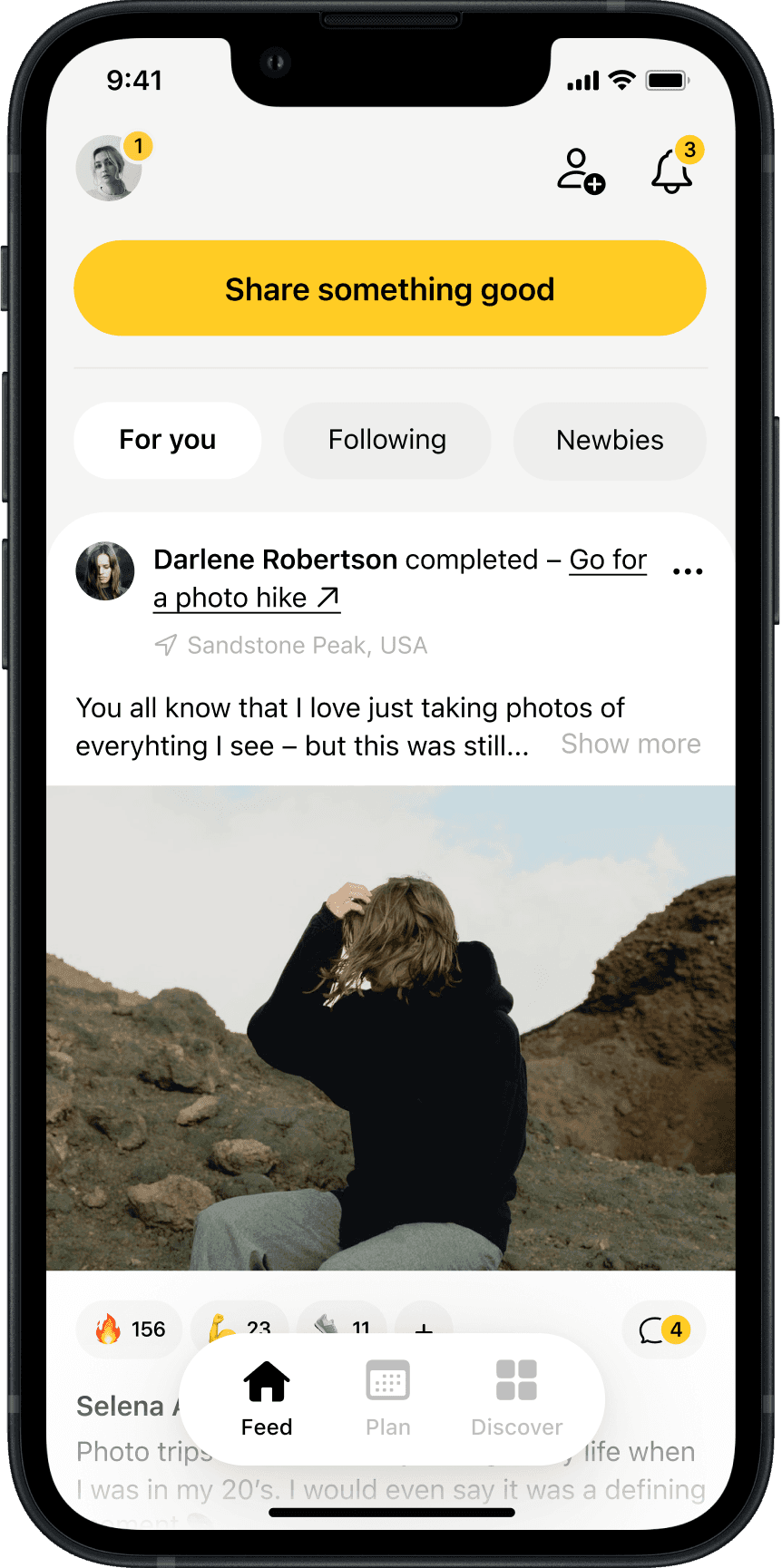
Completed actions feed in the redesigned app

Completed actions feed in the redesigned app

Completed actions feed in the redesigned app

Completed actions feed in the redesigned app

Completed actions feed in the redesigned app

Completed actions feed in the redesigned app

We took the European nutrition label system as a reference point and designed a four-tier meal score: Low, Fair, Good, Optimal. I worked with a graphic designer to develop flat illustrations that carried the tone the research pointed toward — warm, encouraging, non-shaming. It turned a nutrition result into something users were willing to look at.
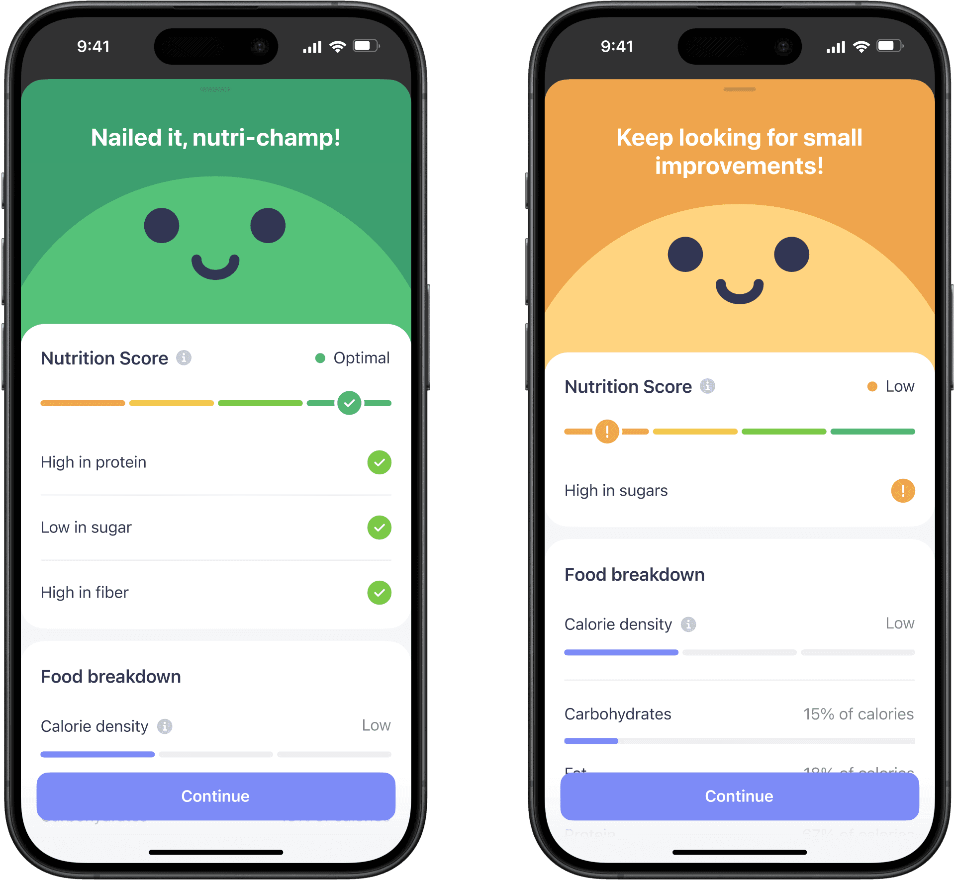
Completed actions feed in the redesigned app

Completed actions feed in the redesigned app

Completed actions feed in the redesigned app

Completed actions feed in the redesigned app

Completed actions feed in the redesigned app

Completed actions feed in the redesigned app

The surface won the British Dietetic Association Digital Innovation Award 2023/24 for Simple App: Nutrition Scores and Food Feedback — external recognition, from a body that knows nutrition, that this was a genuinely useful approach.

Making the next step obvious

Once Food Feedback was in daily use, a new problem emerged. The character made nutrition feedback approachable, but it was taking space the nutrition result needed. Users coming back day after day were asking a more functional question: what did I score, why, and what do I do next? Specifics had to land in seconds, not just be implied by a colour.

The trigger was internal and behavioural: the character presentation was making feedback harder to scan at speed and, for returning users, starting to feel less reliable as a nutrition signal. The design task was clear — move the score to the top of the hierarchy. Result first. Reasoning underneath. Next action close. Personality steps back from the headline.
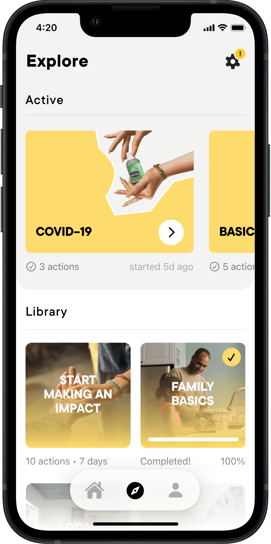
Challenge sub feeds and improved explore

Challenge sub feeds and improved explore

Challenge sub-feeds concept

Challenge sub feeds and improved explore

Challenge sub feeds and improved explore

Challenge sub feeds and improved explore

By this point I was also owning the AI Coach direction, and I brought that work into Feedback: AI-generated explanations replaced static copy, making the reasoning under the score more specific and useful. I collaborated with another designer on sharpening the four-tier scoring system into a more glanceable read. The judgement lands fast. The AI explanation follows. Nothing competes with the result before you've read it.

Modular course-like challenges based on creators' requests

Modular course-like challenges based on creators' requests

Modular course-like challenges based on creators' requests

Modular course-like challenges based on creators' requests

Modular course-like challenges based on creators' requests

Modular course-like challenges based on creators' requests

The experiment validated the direction. D3 meal-track retention improved +3.6% for new users. Time on the result screen dropped 10%. Users spent less time on the result — not because they disengaged, but because they got the answer faster.

Making food tracking multimodal

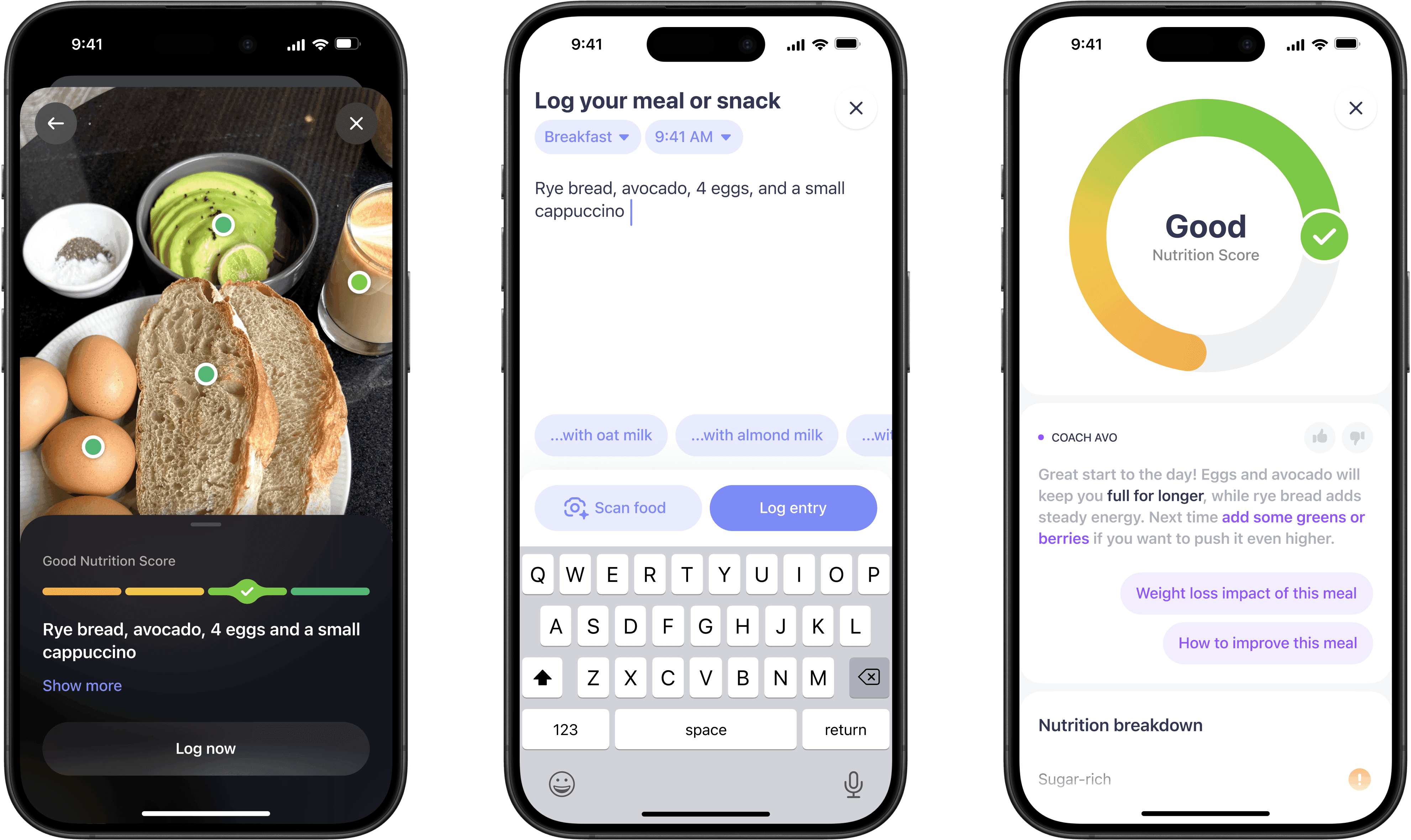
By this point, the feedback loop worked. The remaining friction was the input itself — users still had to describe or type what they ate. Avo Vision removed that. Point the camera at a menu, a plate, or a dish, and the app does the rest.

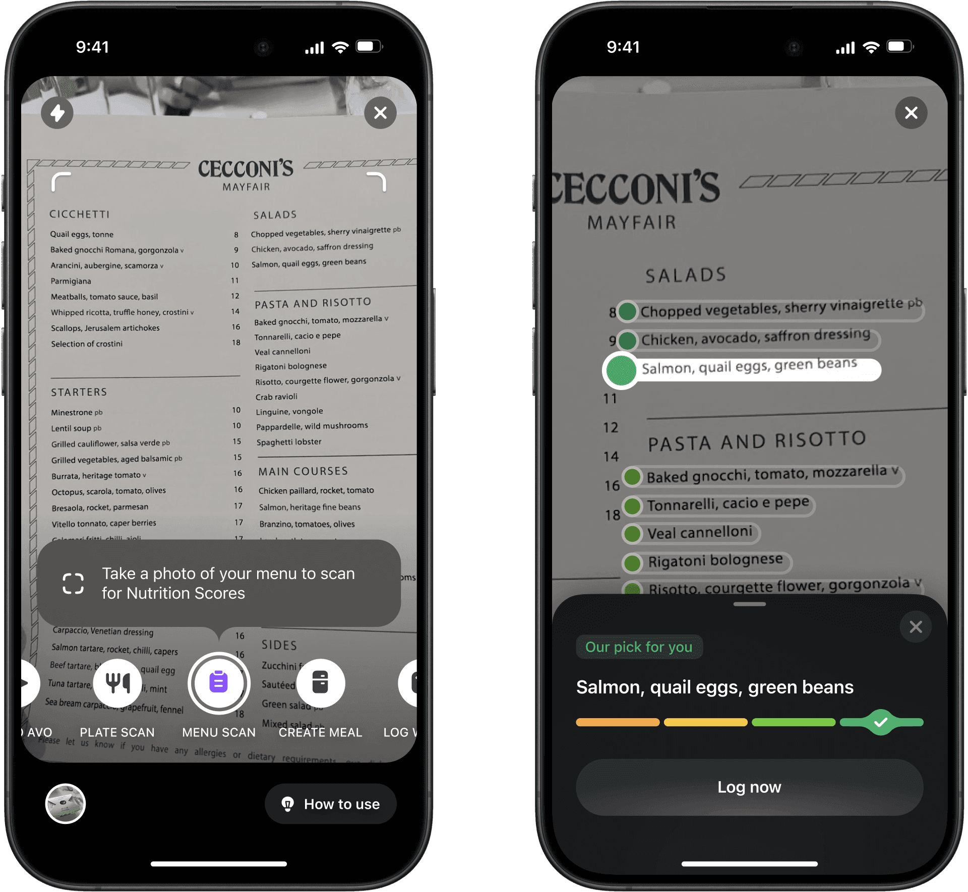
At a restaurant, scan the menu. The app reads each dish, scores it, and surfaces a best pick. You shouldn't have to remember what you ordered at Cecconi's to log it later. It shipped with real limits — dense menus, small print — but the core problem was solved.
Challenge sub feeds and improved explore

Challenge sub feeds and improved explore

Challenge sub-feeds concept

Challenge sub feeds and improved explore

Challenge sub feeds and improved explore

Challenge sub feeds and improved explore

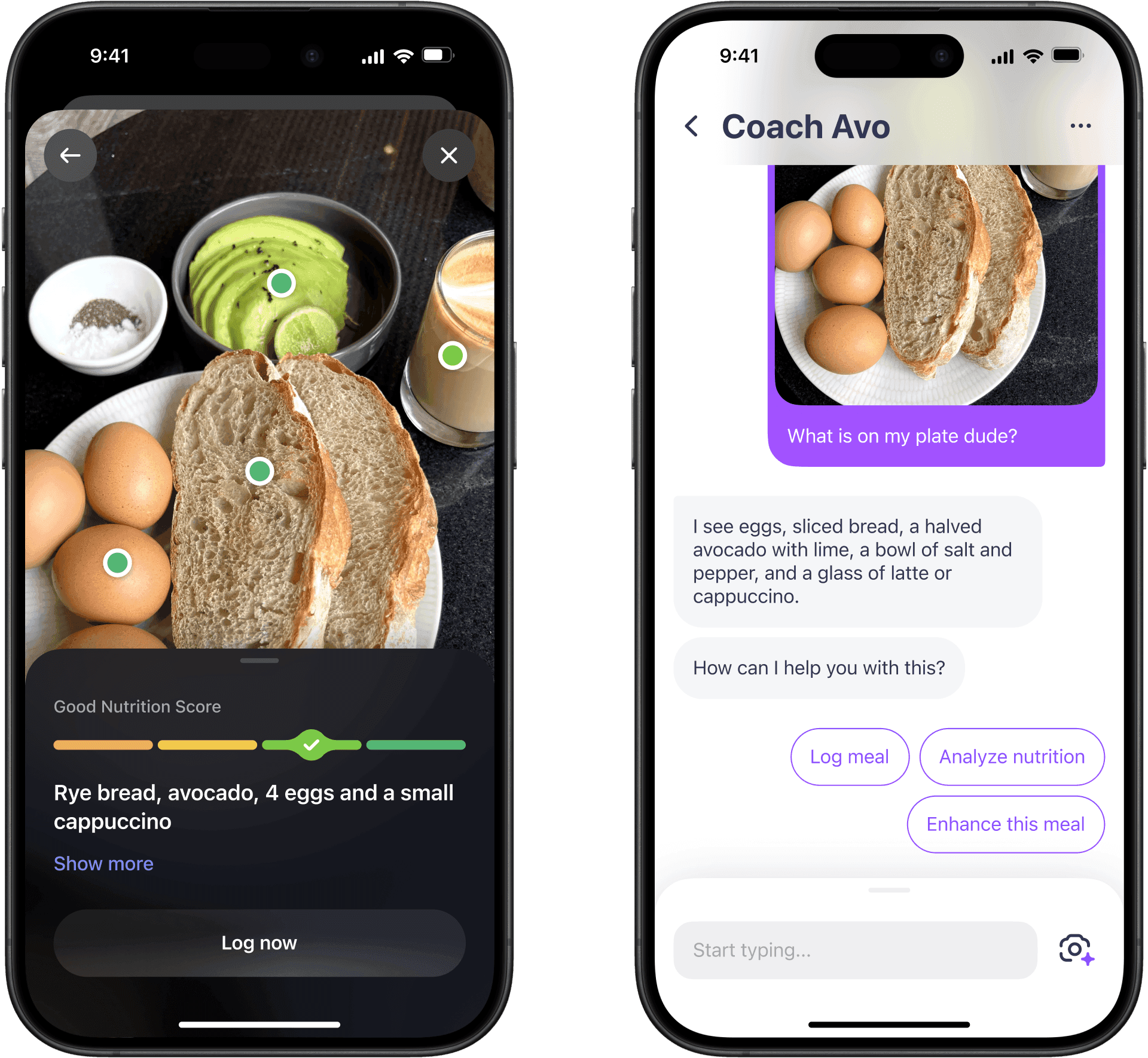
At home, point the camera at your plate. The app identifies the components, scores the meal, and if you want to go further, hands off to Coach Avo directly. Two taps from photo to logged meal.
Modular course-like challenges based on creators' requests

Modular course-like challenges based on creators' requests

Modular course-like challenges based on creators' requests

Modular course-like challenges based on creators' requests

Modular course-like challenges based on creators' requests

Modular course-like challenges based on creators' requests

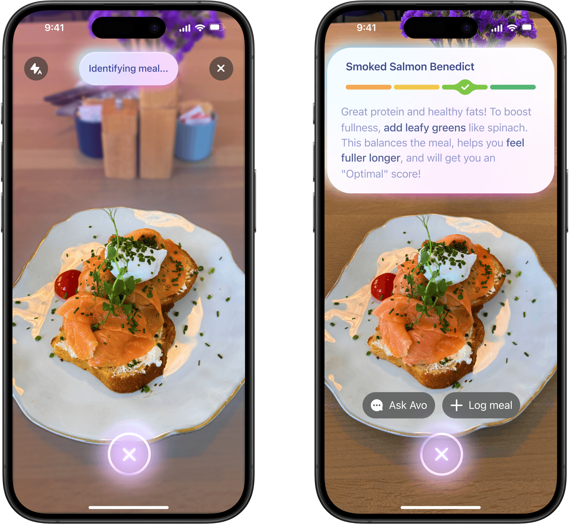
I liked working on this enough to keep exploring in my own time. One idea I kept coming back to as AI models improved: collapse the separate scan modes into one, and surface specific nutrition feedback as you scan — not after, not in chat. We didn't ship this, but it was one of those moments where the work felt worth it on its own.
Modular course-like challenges based on creators' requests

Modular course-like challenges based on creators' requests

Modular course-like challenges based on creators' requests

Modular course-like challenges based on creators' requests

Modular course-like challenges based on creators' requests

Modular course-like challenges based on creators' requests

Avo Vision moved the product retention +2.1% and Avo retention 3d+ moved +4.5%, both significant. By May 2025, 15–20% of all daily meal logs came through the camera. MedTech Breakthrough named smart camera functionality as one of Avo's core pillars when Simple won Best Virtual Coach in 2025 and again in 2026.

Food logging had been an admin task. This is the version where it stopped feeling like one.

Conclusion

Tracker retention

+34%

Cumulative

Product retention

+12%

Cumulative

British Dietetic Association

Innovation Award

Nutrition Score and Feedback

We turned food logging from a minor add-on to the fasting tracker into Simple’s strongest retention loop. It became the foundation for all features that followed.

My work moved metrics, won awards, and became part of Simple’s public story. Food tracking, Nutrition Scores, Avo Vision, and Simple’s broader AI nutrition direction were covered by Forbes, TODAY, TechCrunch, and featured on Apple’s App Store.

What I’m proud of is that we solved a constraint that once sounded almost impossible: make food logging genuinely useful without turning Simple into another calorie counter. We made it feel lighter, more human, and useful enough for people to keep coming back.

Alms showed real demand and strong quality signals: people converted above category benchmarks, rated the app well, and power users came back. We found where the promise was real, but didn’t prove fast enough that offline daily habits could support a venture-backed subscription business.

What stayed with me is product-design essentialism. Craft and speed are only in conflict when you're working on the wrong things. Once you're clear on what matters, polish becomes the natural output, not a tax on it.

I'm proud of how far we pushed the app idea and how much it changed the way I design.

We turned food logging from a minor add-on to the fasting tracker into Simple’s strongest retention loop. It became the foundation for all features that followed.

My work moved metrics, won awards, and became part of Simple’s public story. Food tracking, Nutrition Scores, Avo Vision, and Simple’s broader AI nutrition direction were covered by Forbes, TODAY, TechCrunch, and featured on Apple’s App Store.

What I’m proud of is that we solved a constraint that once sounded almost impossible: make food logging genuinely useful without turning Simple into another calorie counter. We made it feel lighter, more human, and useful enough for people to keep coming back.

Acknowledgements

Built with love from Minsk with Alex Nevedovsky, Sasha Khadeka, Nick Shchetko, Sofia Chop, Joanna Buchmeyer, Roman Kutanov, Andrei Lunevich, Sergei Borovkov, and Dzianis Nikitsin. Thanks to everyone who cared, tested, and gave advice along the way. Alex – thank you for seeing my potential early.