Gamified habit tracking
Simple
1 May, 2026
As design owner on Simple’s Gamification team, I designed the company’s first gamification system and shaped its mascot. My work drove category-leading retention uplifts and became core to the app’s identity
Timeline
2024–2026
Role
Senior Product Designer
Scope
UX/UI, Art Direction
Product
1
N
, B2C, Wellness
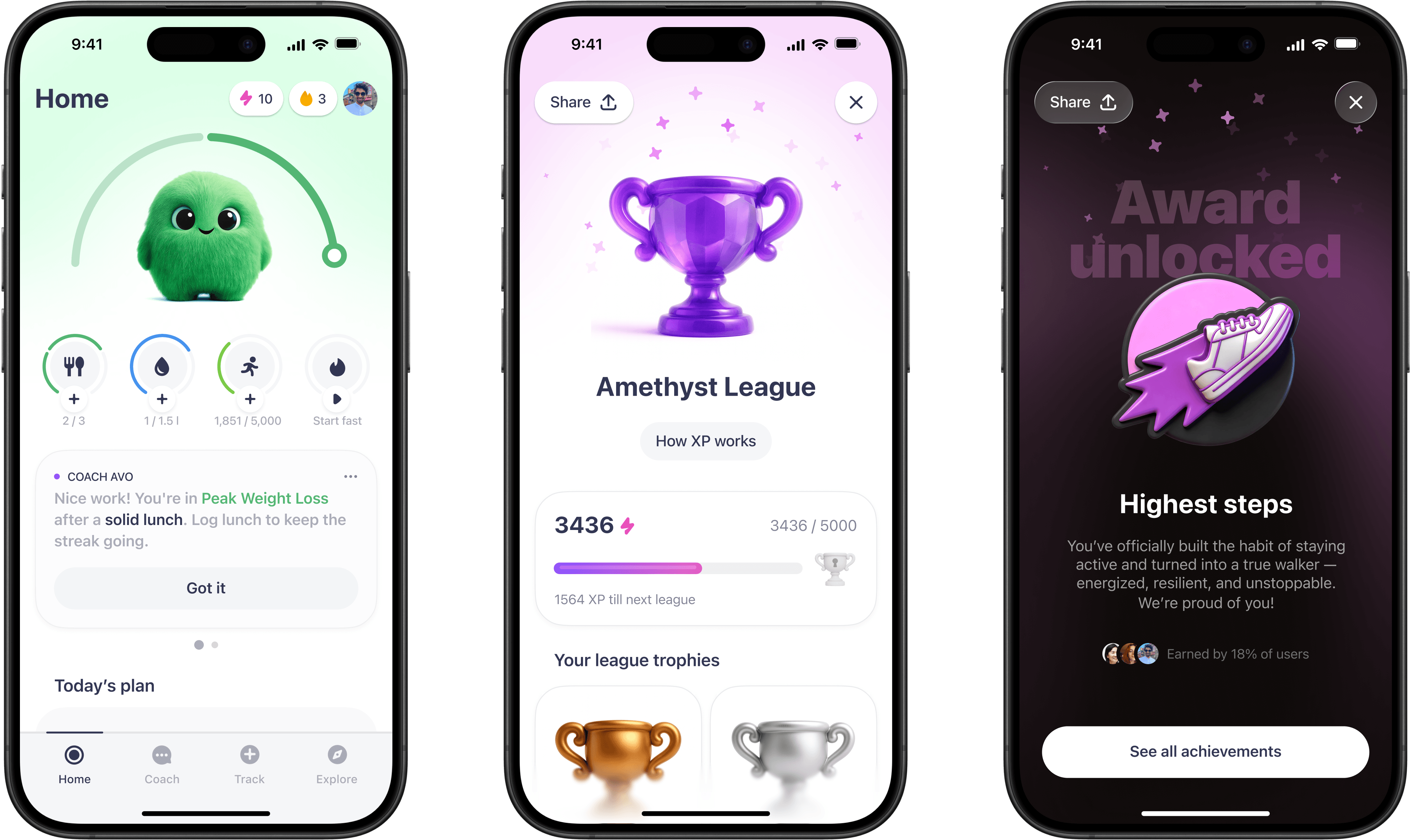


Simple is a health and weight-loss app backed by Palta (Flo Health, Lensa). It’s one of the leaders in its category, with 15M+ downloads, $160M+ ARR, 400K+ MAU. The audience is mostly women over 40, disillusioned with traditional dieting.
Food tracking made Simple useful beyond fasting. AI Coach made it feel more personal and holistic. But neither solved the brutal part of health apps: people learn what helps, then stop doing it. By 2025, paid growth was getting harder, so Simple needed stronger organic pull.
The challenge
Duolingo was the exception: in a struggling market, it kept growing by turning repetition into something users felt ownership over – visible progress, meaningful streaks, and an emotional cost to disappearing.
The challenge was translating that success into weight loss. Logging, check-ins and recovery had to feel worth repeating without making the product feel cheap or childish.
Testing the loop
Before adding characters or emotional stakes, I needed proof the core habit loop could move repeat use. I started with streaks for commitment and freezes for recovery: the lowest-risk way to test Duolingo-style habit mechanics inside a serious health product.


Freezes made streaks forgiving and moved retention, but they also flattened the difference between a saved streak and a clean one. Perfect Streak restored that distinction: casual users stayed happy, while power users got a higher-status goal worth chasing.


Streaks and freezes delivered: +24% to product retention and +21% to meal-tracking retention. The loop worked. Now the question was how much emotion it could carry.
Finding Blinky’s role
The next bet was emotion. I worked with an engineer to build a rough first version of Blinky, a soft pet-like mascot that gave daily consistency a face. The test was messy and aggressive, but the results were huge.


That proof changed the design problem. The question was no longer whether Blinky could get attention – it was how to make him feel native to Simple. I explored his role, home, reactions, and visual language across streaks, feedback, home, and unboxing.


At the same time, another team was shipping a Success Score: a real-time weight-loss signal reacting to users’ logs. Both were becoming central company bets, so it only made sense to combine them. I made Blinky the emotional face of the score, reacting to what users actually did each day.

I defined the home-screen integration: Blinky's first entry, score states, emotional reactions, and tone of voice. He had to feel like a silly, honest pet – expressive enough to make progress feel alive, careful enough not to make bad days feel heavier.
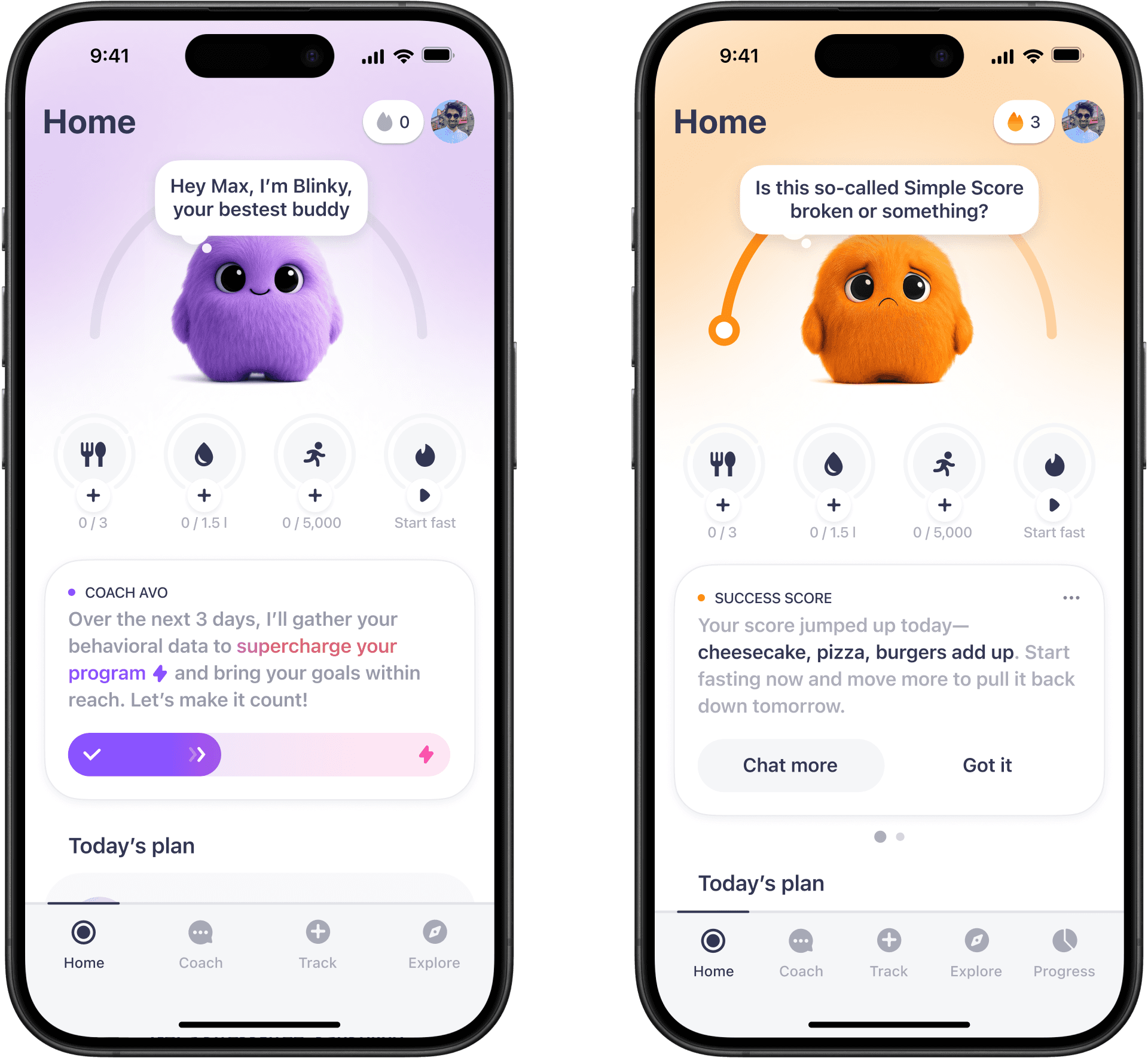

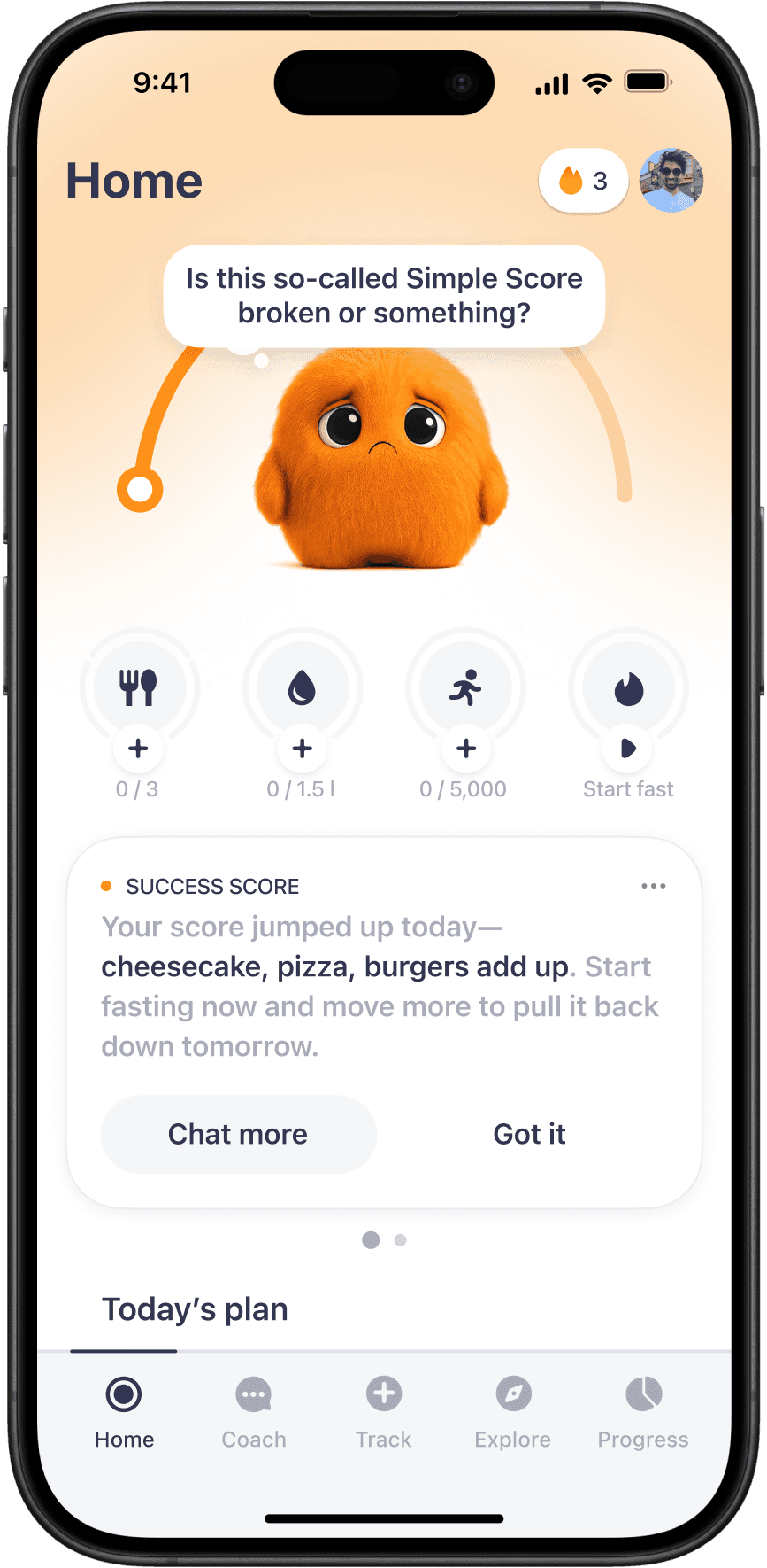
Once Blinky Score shipped, we needed to scale him across the app. AI image generation was frustratingly unreliable, so I turned the look we’d landed on into simple guidelines other designers could follow.

Blinky score integration moved cancellations down 6%, doubled score-related coach conversations, and lifted activity tracker retention by 8%. Home screen was no longer just about feedback. It had emotional weight.
Loss aversion
Once users cared about Blinky, his absence became a lever. I pushed the visual system hard, exploring dead, ghosted, and weird versions of him. My goal was a calm default with wilder variants held back for push notifications that really needed to cut through.


The sharpest version became Blinky Dies. If users stopped logging, Blinky disappeared from the home screen and came back as a ghost. The mechanic was simple and brutal: one log could revive him, but doing nothing had a visible emotional cost.


After the in-app loop was clear, I worked with the CRM team to extend Blinky outside the app. We brought the same emotional states into pushes, widgets, and Live Activities, nudging users while there was still time to recover.

The results were strong. Blinky Death proved the ceiling, driving +15% D7 product retention, +20% meal-tracking retention and lifting Live Activity CR by 22%. The pull worked. Now we had to make it feel fair.
The reward trap
Accountability had proven it could pull users back. But guilt burns out, so I needed to create value inside the app while weight loss was still too slow to see.
My first bet was to capitalize on the success of Streaks with Milestones. With Blinky already in the product, I could turn those moments into proper celebrations.


Milestones looked good but didn't move metrics. If rewards were going to work, they needed accumulated value, not just a nice moment. I designed XP as currency for healthy actions, league rank as something to defend, and trophies as visible progress worth keeping.
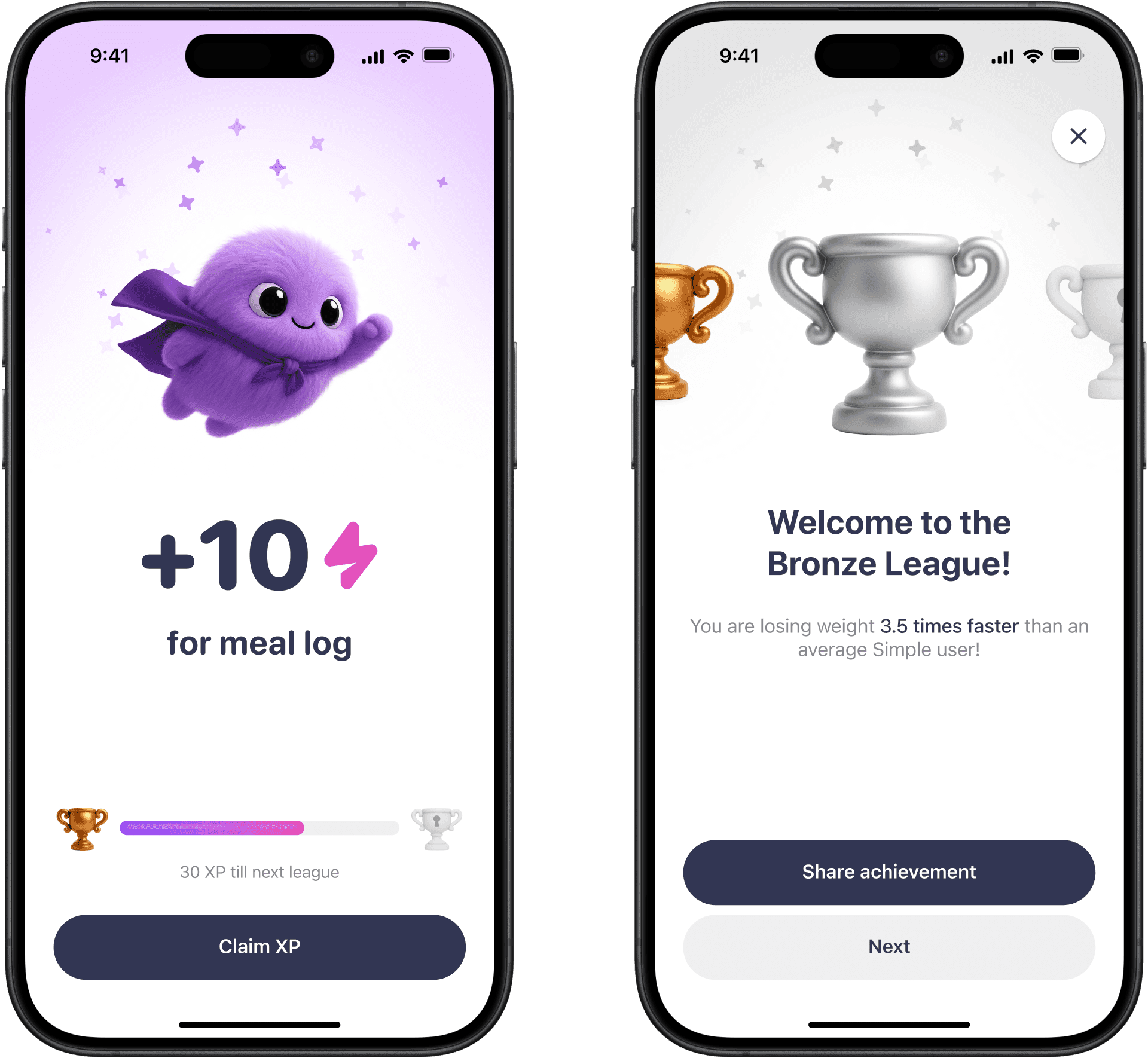

I did hundreds of AI-gen iterations to make the trophies feel consistent across ranks. The hard part was not making shiny objects, but finding the right prompt so the shape, lighting, and materials belonged in Blinky’s universe.

Tests and interviews made the limit clear. XP was too loud, too abstract, and too disconnected from weight loss. Users liked progress, but full-screen interruptions and hollow rewards made it fight the core logging loop.
So I reframed the reward itself: attach it to Blinky, not a vague rank. With unlockable costumes, I bet on the character users already cared about.


The UX also got quieter. Instead of full-screen interruptions, XP could live as a home-screen toast and feed into customisation over time, without blocking the core logging flow.


Unfortunately, milestones and trophies had no impact on metrics and customisation wasn't tested when priorities shifted. We'd fallen for the classic reward trap: adding more celebration without making it mean anything.
Proof of progress
We still believed rewards had value, but now they had to mean something. My next hypothesis was achievement badges tied to each user’s weight-loss goals.
I started by testing two visual directions: a custom style tailored to Blinky’s world and industry-standard metallic badges. Users preferred the first.

To get the art right, I collaborated with two teams to test different approaches in parallel: pure AI generation versus graphic sketches with AI on top. The graphic-design-led one won: more intentional, readable, and true to the product system.

In the new flow, progress stayed quiet on the home screen, and the big unlock moment appeared only when users had actually earned something.


Pre-validation was strong: 70% of users found badges appealing, and 82% said achievements felt motivating. With metric impact still pending, we shipped the clearest version of the reward thesis so far.
Conclusion
Product retention
+35%
Cumulative
Tracking retention
+41%
Cumulative
Sensor Tower benchmark
#1 retention growth
Among digital health leaders
Gamification became one of Simple’s clearest growth stories. My work moved the metrics the business cared about most and helped Simple stand out as one of the few major health apps growing retention while the wider category was declining.
Blinky turned from a crazy experiment into a company asset. I helped create a character that became central to the app’s identity, App Store presence, marketing, and strategy. Inside the company, people used Blinky as their avatars, made merch, and leaders called out the quality of my visual work directly.
I’m proud that we did not just copy Duolingo. We took the mechanics that worked and made them fit a product where progress is slower, more personal, and easier to feel ashamed of.
Acknowledgements
Built remotely with a team spread across the world: Maxim Borodin, Alex Ovs, Vanya Tokarev, Ekaterina Pisareva, Trey Reck, Elizabeth Kim, Andrei Belaveshkin, Nikita Borisov, Ilia Amelchenkov, Ilya Dolbik, Elizaveta Milovanova, Zafar Ivaev, Sergei Syzdykov, Maksim Shchepalin, Maksim Kamenskii, Tina Kovalchuk, Ivan Bakanovskiy, Hemank Sabharwal, David Johnston, and Indre Strazdaite.
Special thanks to Max, Alex, and Vanya. We got to Duolingo-level polish with a tiny team and a fraction of the resources because you cared about every detail, from weird AI-gen artifacts to the smallest emotional tweaks.