AI health coach
Simple
1 May, 2025
As the sole designer on Simple's AI, I shaped Avo into a coaching layer woven across the app, helping transform the product into an AI health coach. My work scaled to millions of conversations, drove major retention uplifts, and won back-to-back industry awards
Timeline
2023–2025
Role
Senior Product Designer
Scope
AI Product Design, Prompt Design
Product
1
N
, B2C, Wellness
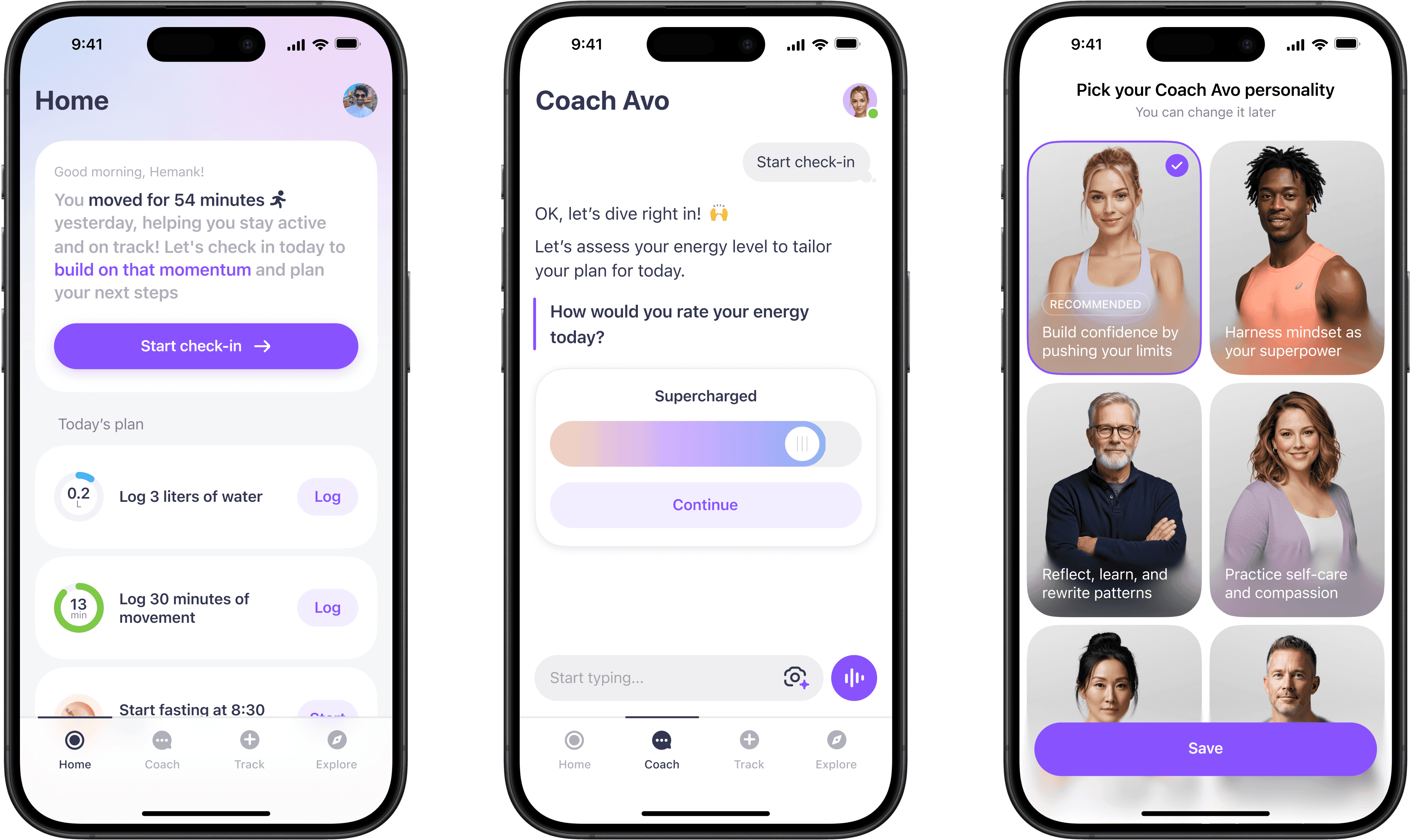


Simple is a health and weight-loss app backed by Palta (Flo Health, Lensa). It’s one of the leaders in its category, with 15M+ downloads, $160M+ ARR, 400K+ MAU. The audience is mostly women over 40, disillusioned with traditional dieting.
We had already pushed fasting and tracking far. Food logging gave users more reasons to engage and gave us richer data, but fasting and calorie-tracking apps were becoming a commodity. To keep growing and raising money, Simple needed stronger retention and clearer differentiation.
The challenge
As LLMs became viable in 2023, leadership's bet was using AI coaching as the connective tissue between Simple's trackers, to raise retention and build personalized value at scale.
Approach
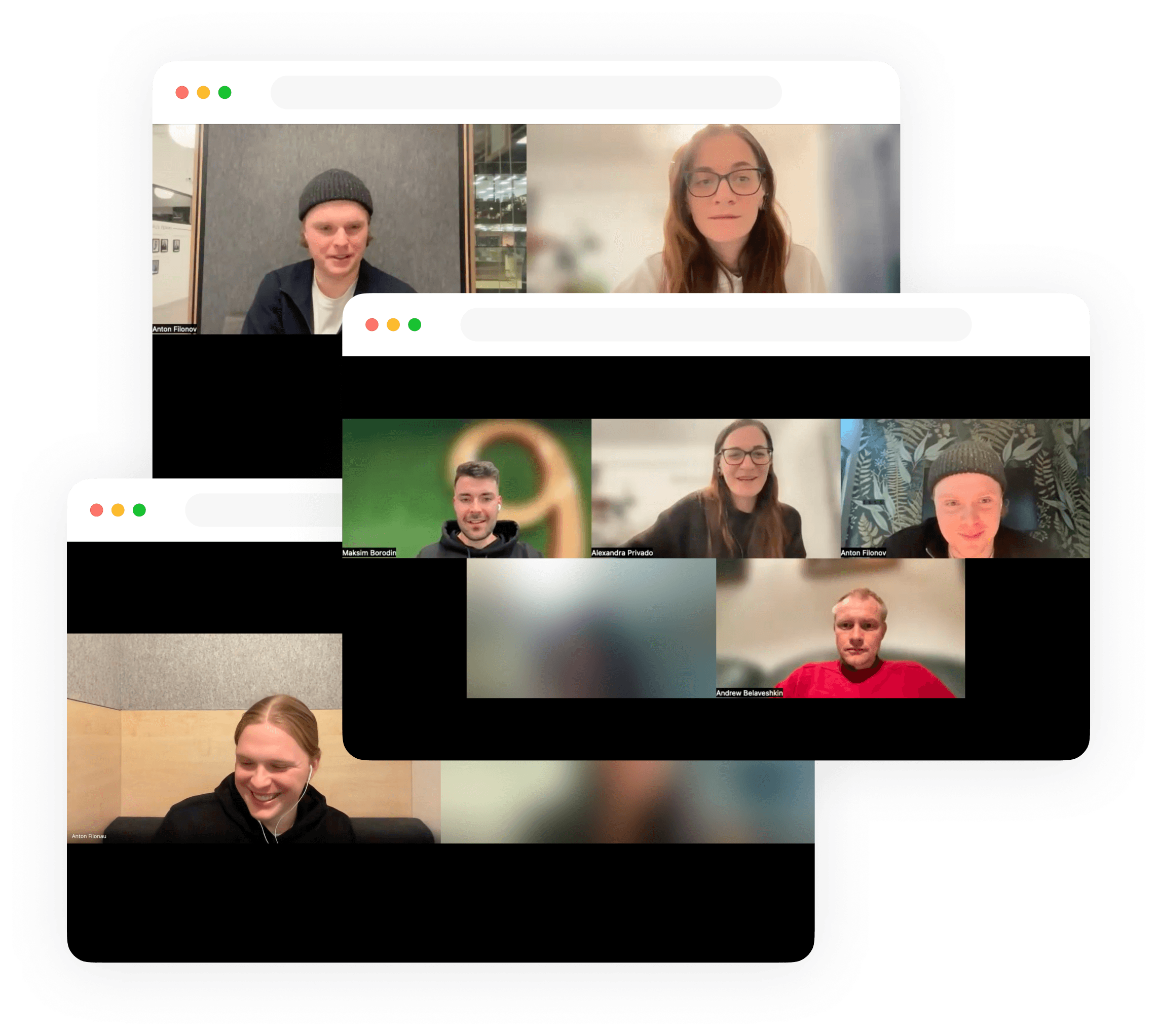
We ran weekly user rituals throughout the project. Early on, that meant talking to users about their general experience with the app and what felt missing. Once the AI coach was live, I read anonymised conversations, spotted friction, and connected it to what the metrics showed.

As the product expanded, users complained more about complexity and confusion. They were missing a guidance layer that turned all their tracking into value. That aligned with the AI bet.
Our approach was to ship the smallest AI coach version to be first to market, choosing real behavioural signal over a polished launch. I partnered with the PM and engineers on the backlog and with science on LLM prompt design, aligning with the CEO on key decisions.
Getting users in
The first shipped version of Avo was extremely minimal and the results were flat. But with only 4% of users completing a first chat and 70% dropping off on the terms screen, we couldn't judge the direction yet. First we had to fix the funnel and get people in.
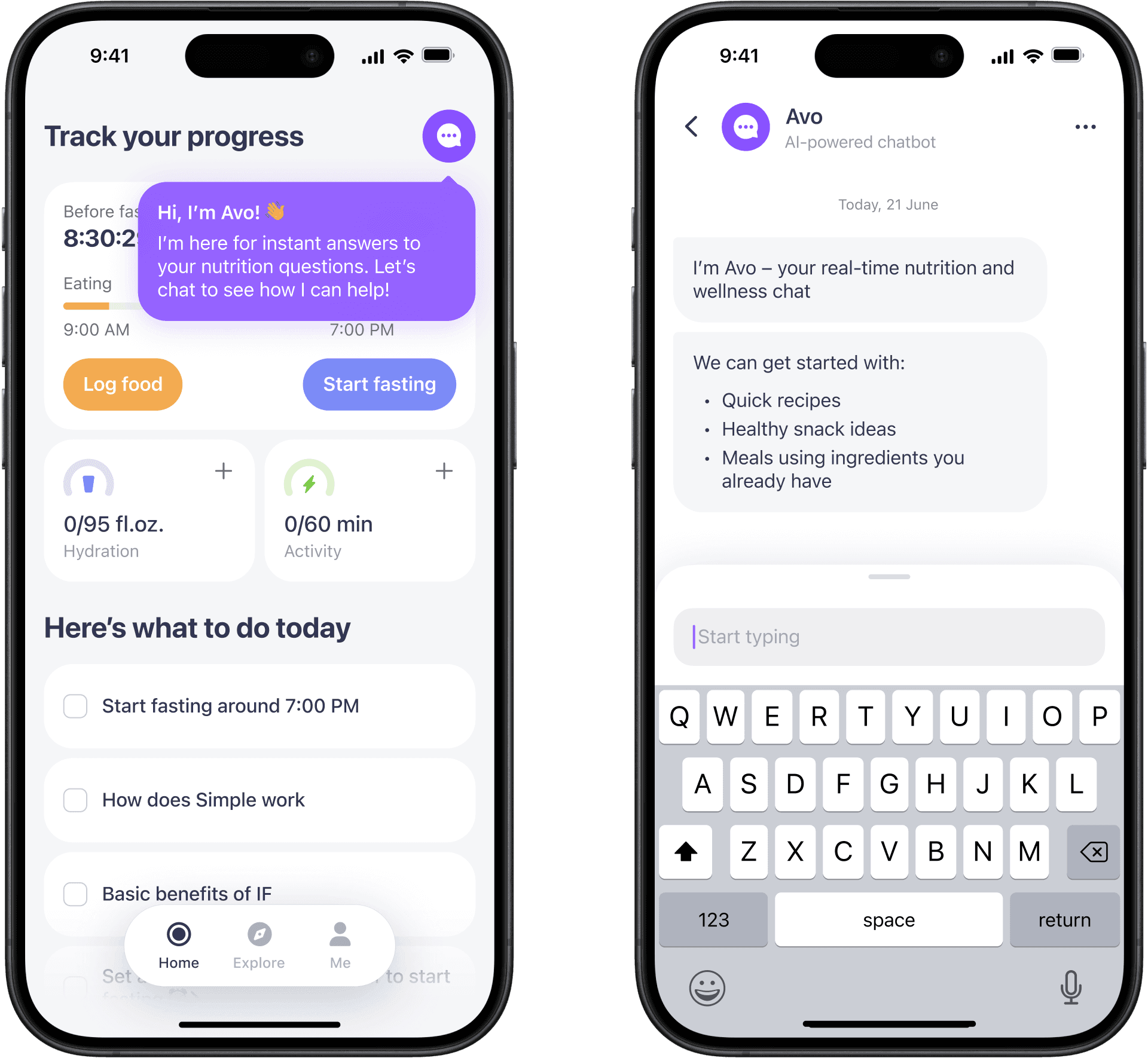

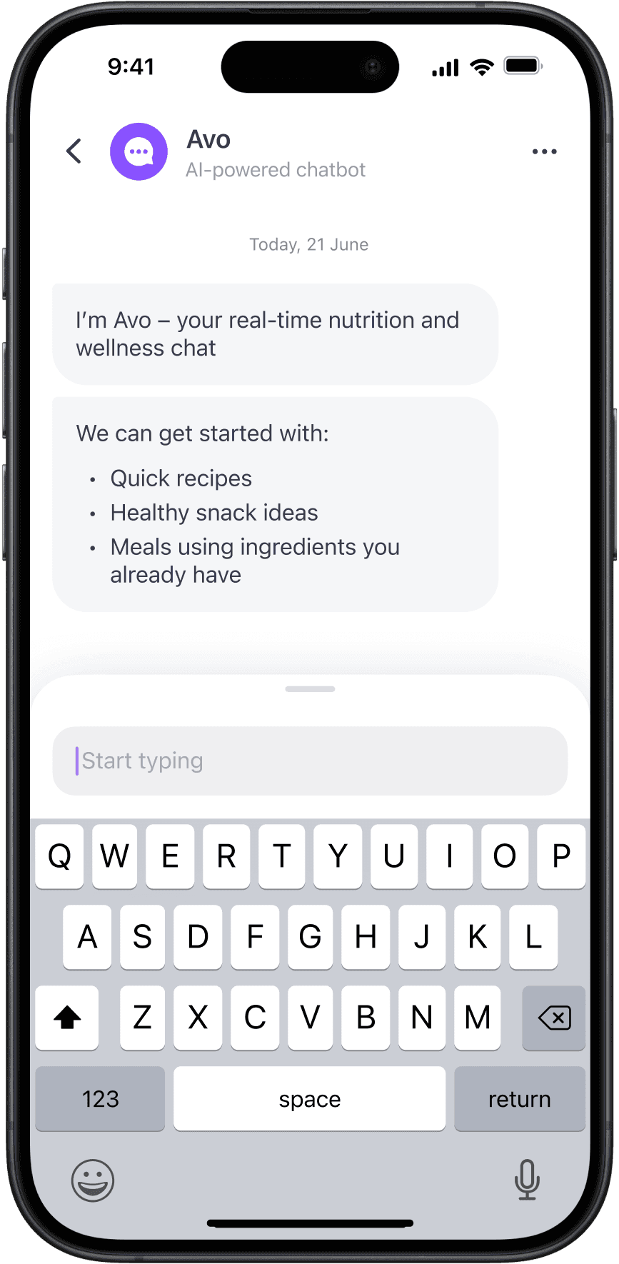
First I pushed back on the legal checkboxes and made terms acceptance an inevitable part of the flow. Then I turned to discoverability and explored different entry points, unboxing flows and suggested prompts.


Between adding more explanation and removing friction, I chose the latter: chat history became one unified chat, suggestions appeared only in context, and terms no longer had to be accepted manually.
Early funnel experiments lifted opens by +146%, first chat completions by +124%, and D1 product retention by +3%. That proved even the most basic AI Coach had value.
Useful in context
After we got people into Avo, the next question was how to make it useful. Instead of pushing more users to open the chat, I brought value into moments where intent already existed: after meal, weight, and activity logs.
I started with static triggers, then evolved them into context-aware feedback. After a log, Avo used fresh user data to respond with timely, actionable guidance.
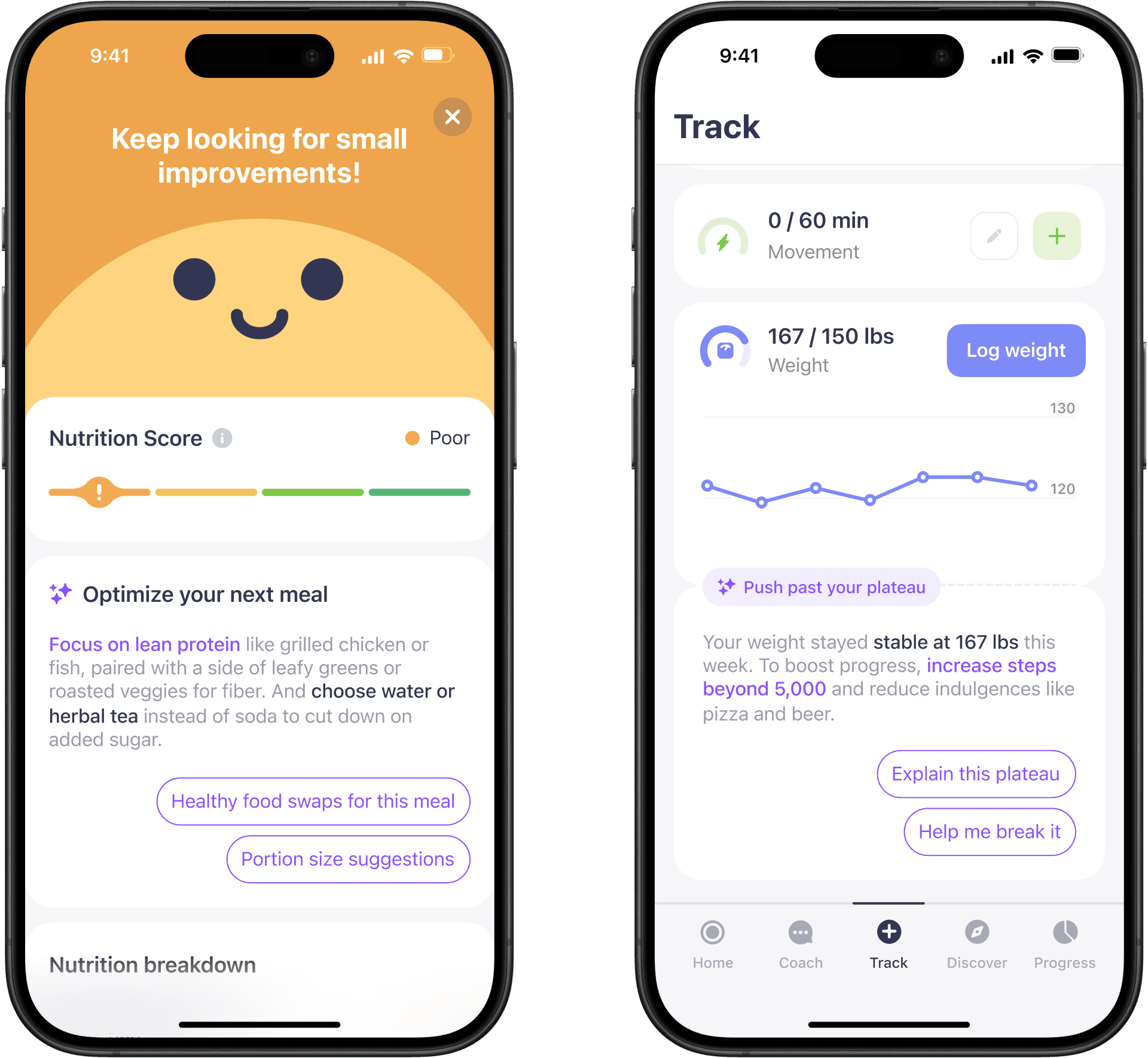


Across trigger iterations, Avo started becoming useful outside the chat window, increasing chat time by +88%, trigger-to-chat conversion by +92%, and tracks per user by +11%.
Daily ritual
Once Avo proved its value, leadership doubled down. Could it become the daily loop that brought users back every day? With the old tracker dashboard moved to a separate tab, I explored how Home could be rebuilt around coaching.


I explored coach inserts in the tracker dashboard, contextual chat widgets, and a simpler plan-led home. I chose the latter to test the core hypothesis first: open the app, check in with Avo, get a plan, repeat.
The styling followed the same logic: novel enough to signal the shift, but still familiar enough to feel like Simple. Bright purple made Avo feel special, but hurt legibility. Orange felt fresh, but pushed too far into rebrand territory.
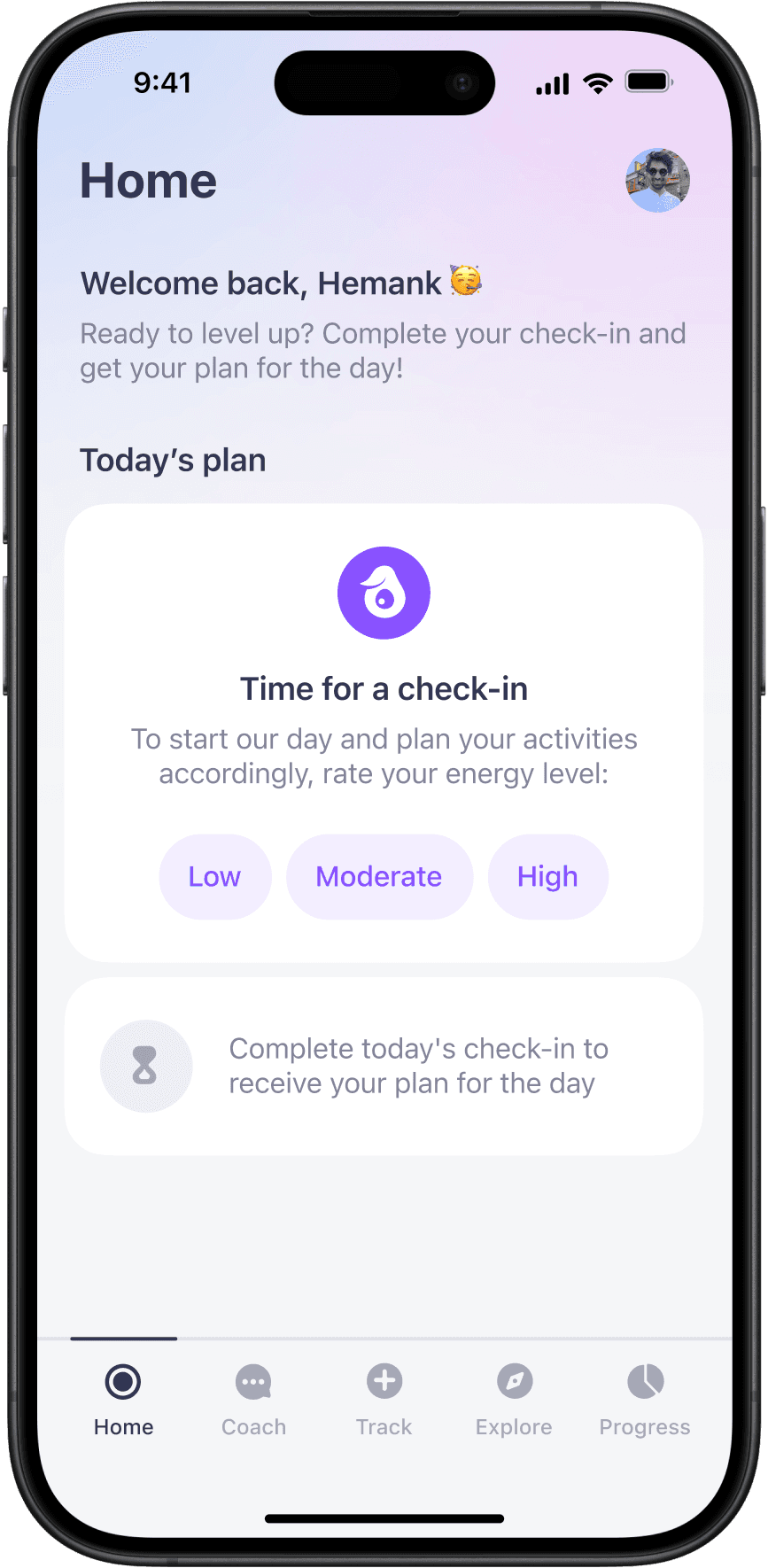
The loop worked, but users found the check-in scripted, bloated, and not personal enough. To make the ritual more personal and easier to repeat, I introduced quicker navigation, visual recaps, optional dive-in steps, and personalised reasoning for the day ahead.
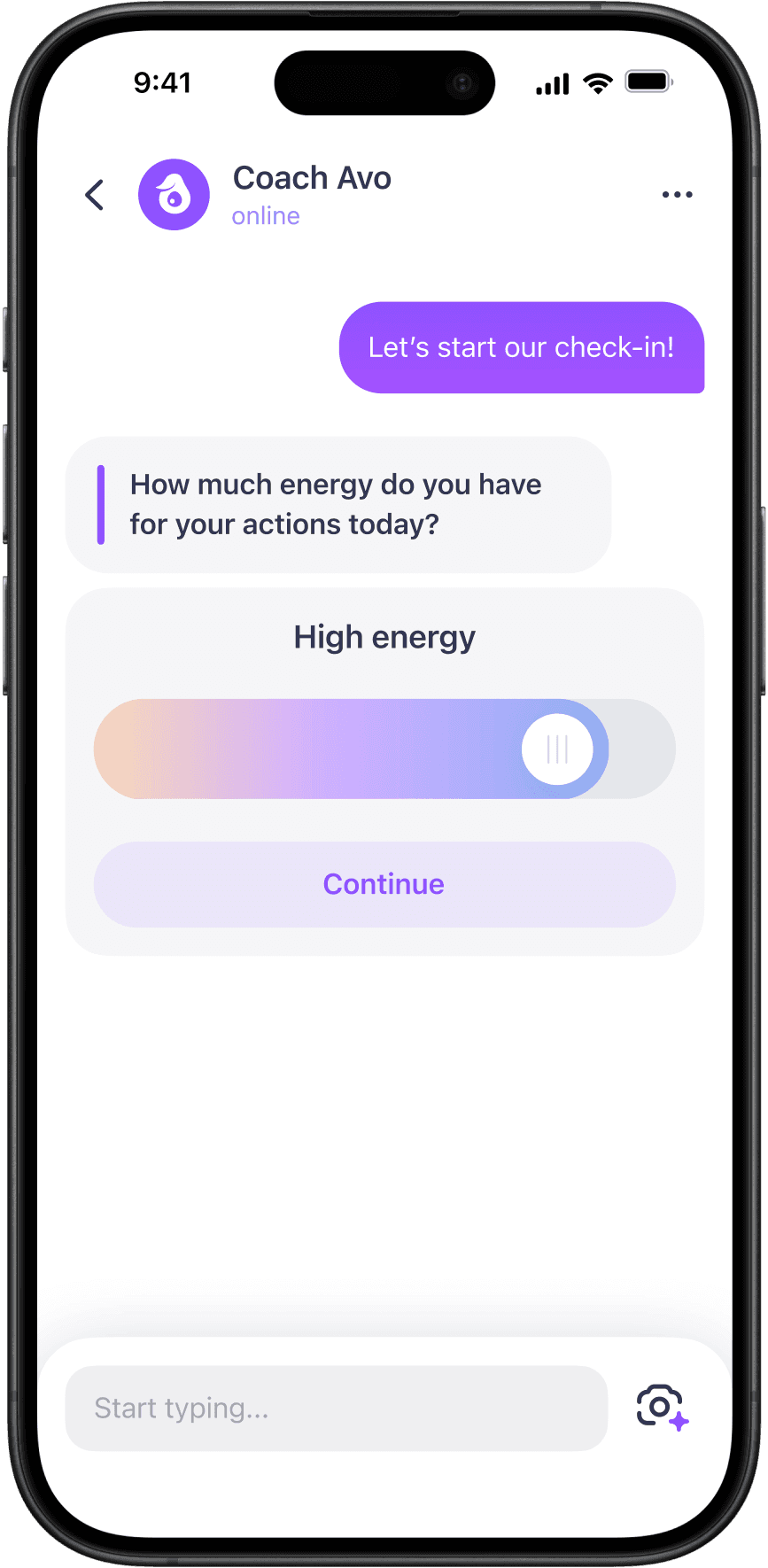

Together, the daily check-in, home redesign, and later iterations added up to +16.1% product retention growth. The loop also became much stronger itself: check-in D3 retention grew by 21.7%, while check-in completion grew by 144%.
Going proactive
While exploring the daily loop, we kept hitting the same idea: Avo could bring deeper value by reading Apple Health and tracking signals, updating the plan on the fly, and turning yesterday's behaviour into insights.
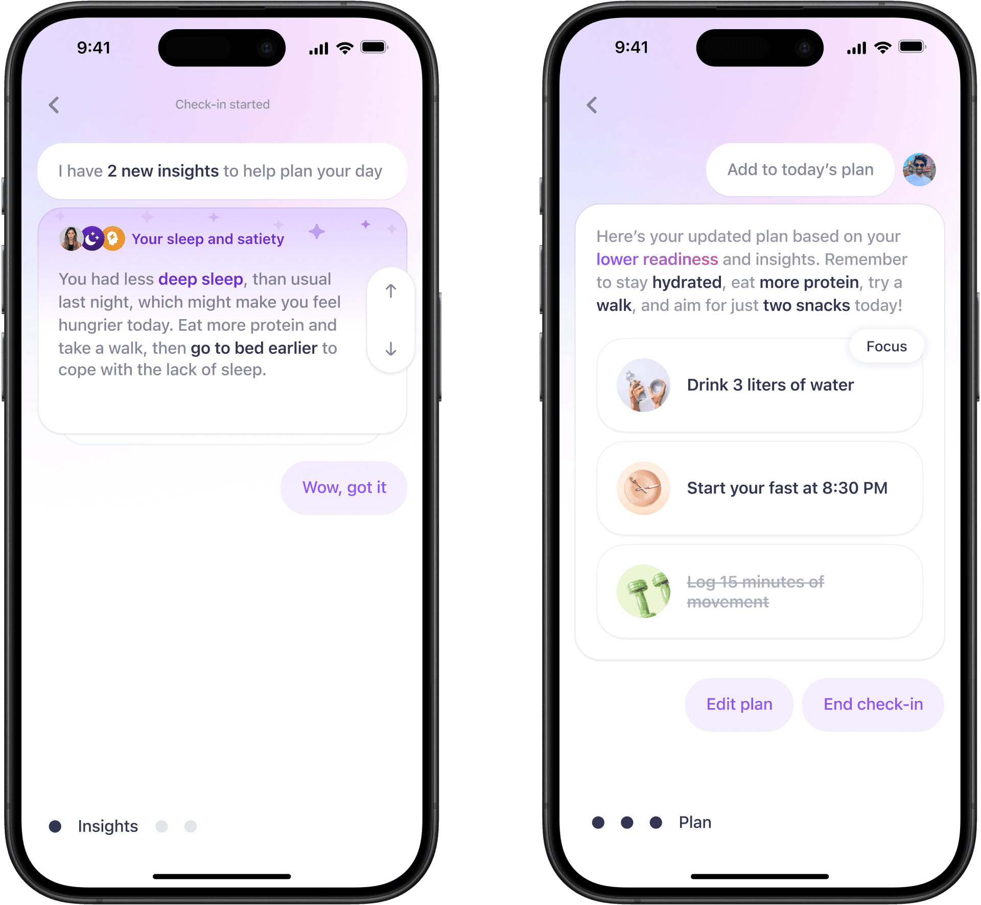


That idea quickly outgrew the check-in and became its own direction: interactive insight cards. Instead of waiting for any user interaction, Avo could surface context and next steps directly on the Home screen.


Since passive insights rarely change behaviour, we tested Patterns as the best version of the proactive idea: Avo spotting repeated behaviours and turning them into small challenges, so logging felt more valuable.


Users who engaged found real value: better awareness, habits, and motivation. But the feature failed discovery. Only 30% of users received a pattern, challenge completion was weak, and product retention didn’t move.
We parked Patterns as a standalone direction and later reused the logic in contextual triggers, where discovery was stronger. The learning was simple: coaching only works when it appears where users already expect guidance.
Cleaning it up
As more Avo features shipped, the design debt started to show: broken navigation, outdated visuals, formatting glitches, and responses split into too many separate messages.
User research confirmed the same issue from the user side: bloated answers, confusing interaction patterns, and a need for easier navigation.


When the timing was right, I pushed for the cleanup, even though it was hard to justify in a pragmatic, metric-led company. I led brainstorms to find a style to solve the UX issues and match where Simple’s design was heading.
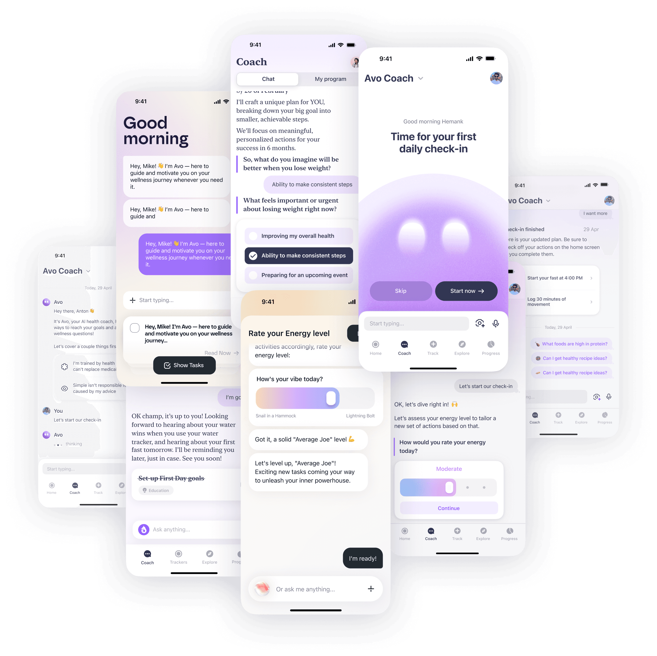

The cleanup was not only visual. I worked with the PM to make Avo more concise: fewer response splits, less bloat, and a more humane tone.
The shipped version reduced chrome, improved legibility, fixed navigation, and made Avo feel calmer and properly integrated into the product.

This shipped without isolated tests. It was foundation work: hard to measure, but necessary for Avo to feel world-class.
Getting personal
Since the original bet was to mimic human coaching, letting users choose their coach became a natural next step. Research pointed in the same direction: users wanted coaches that felt realistic, age-appropriate, and diverse.
So the decision was not to design one better avatar. It was to let users choose.


I shaped the coach library with an AI generation specialist and a UX writer. Choosing a coach changed more than the picture: it also applied a custom tone of voice in the system prompt, giving each coach a distinct identity across the product.
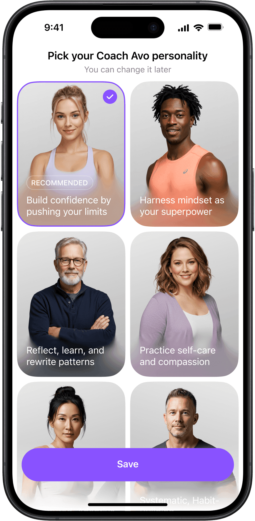
The results wrapped up the original “coach in your pocket” bet nicely: +6% D7 product retention and +4.5% Avo retention showed that personalisation alone could bring users back.
Conclusion
Product retention
+25%
Cumulative
MedTech Breakthrough
Best Virtual Coach
2025 and 2026
Avo adoption
40%
active users
Messages
23M
Monthly
The easy version of this project would have been another floating chatbot button. What we built instead was something ChatGPT could not solve on its own: a coaching layer integrated into the user journey – knowing when to appear, what context to use, what action to suggest, and how to feel like the same coach every time.
Avo started as a bet to mimic some of the value of a real coach. In the end, it fulfilled that promise as one of Simple’s most loved features: moving retention, growing subscriptions, and scaling to millions of conversations every month.
My AI Coach work became a key part of Simple’s public story – winning awards, being featured by Apple’s App Store and Forbes, and helping the company raise a $35M Series B round.
Acknowledgements
Built remotely with a team spread across the world: Hemank Sabharwal, Maxim Borodin, Alex Ovs, David Johnston, Ilia Amelchenkov, Josie Porter, Andrew Belaveshkin, Karina Delaine, Elizaveta Milovanova, Zafar Ivaev, Sergei Syzdykov, Nikita Borisov, Maksim Shchepalin, Ilya Dolbik, Maksim Kamenskii, Tina Kovalchuk, Elizabeth Kim, Ivan Bakanovskiy, Anton Kulina, and Alesia Privado.
Special thanks to Hemank for making the original AI coach bet real, Maxim for carrying Avo through endless iterations and hard product calls, and Alex for helping us explore the wildest ideas.